最新资源


简介
用于创建自定义web界面的流行Bootstrap 5框架有很多不错的好处;然而,有一点需要注意,那就是可以从庞大的Bootstrap图标目录中轻松选择图标,但现在你可以通过这个新插件获得这个选项。
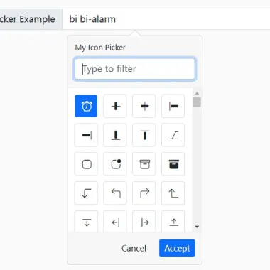
这是一个完全可定制的jQuery,它使用Bootstrap 5 popover组件来创建一个可过滤的图标选择器界面,它提供了一种从1600多个Bootstrap SVG图标中选择图标的简单方法。
请参阅实际操作:
如何使用它:
1.在文档中加载必要的jQuery库、Bootstrap 5框架和Bootstrap Icons。
<!-- jQuery -->
<script src="/path/to/cdn/jquery.min.js"></script>

<!-- Bootstrap 5 -->
<link rel="stylesheet" href="/path/to/cdn/bootstrap.min.css" />
<script src="/path/to/cdn/bootstrap.bundle.min.js"></script>

<!-- Bootstrap Icons -->
<link rel="stylesheet" href="/path/to/cdn/bootstrap-icons.min.css" />
2.下载插件并加载以下JavaScript和CSS文件。
<link href="/dist/css/bootstrapicons-iconpicker.css" rel="stylesheet" />
<script src="/dist/js/bootstrapicon-iconpicker.js"></script>
3.将引导图标选取器连接到您指定的输入字段。
<input type="text" class="form-control iconpicker" placeholder="Icon Picker" aria-label="Icone Picker" aria-describedby="basic-addon1" />
$(function(){
  $('.iconpicker').iconpicker();
});
4.在初始化图标选择器时,您可以提供更改其外观的选项。所有可能的选项:
$('.iconpicker').iconpicker({

  // Icon picker title
  title: false,

  // Selected icon on init
  selected: false,

  // Default icon
  defaultValue: false,

  // inline
  // topLeftCorner
  // topLeft
  // top (center)
  // topRight
  // topRightCorner
  // rightTop
  // right (center)
  // rightBottom
  // bottomRightCorner
  // bottomRight
  // bottom (center)
  // bottomLeft
  // bottomLeftCorner
  // leftBottom
  // left (center)
  // leftTop
  placement: "bottom",

  // Determine whether to re-position the icon picker
  collision: "none",

  // Enable animation
  animation: true,

  // Hide the icon picker on select
  hideOnSelect: false,

  // Show popover footer
  showFooter: false,

  // Place the search filed in the footer
  searchInFooter: false,

  // Pick the icon when click the accept button in the footer
  mustAccept: false,

  // CSS class for the selected icon
  selectedCustomClass: "bg-primary",

  // List of icon objects
  icons: [],

  // Custom class formatter
  fullClassFormatter: function (e) {
    return e;
  },

  // Input selector
  input: "input,.iconpicker-input",

  // Determine whether to use this the input as a search box
  inputSearch: false,

  // Append the icon picker to a specific element
  container: false,

  // Default selector
  component: ".input-group-addon,.iconpicker-component",

  // Customize the template here
  templates: {
    popover: '<div class="iconpicker-popover popover" role="tooltip"><div class="arrow"></div>' + '<div class="popover-title"></div><div class="popover-content"></div></div>',
    footer: '<div class="popover-footer"></div>',
    buttons: '<button class="iconpicker-btn iconpicker-btn-cancel btn btn-default btn-sm">Cancel</button>' + ' <button class="iconpicker-btn iconpicker-btn-accept btn btn-primary btn-sm">Accept</button>',
    search: '<input type="search" class="form-control iconpicker-search" placeholder="Type to filter" />',
    iconpicker: '<div class="iconpicker"><div class="iconpicker-items"></div></div>',
    iconpickerItem: '<a role="button" href="javascript:;" class="iconpicker-item"><i></i></a>'
  }

});
预览截图
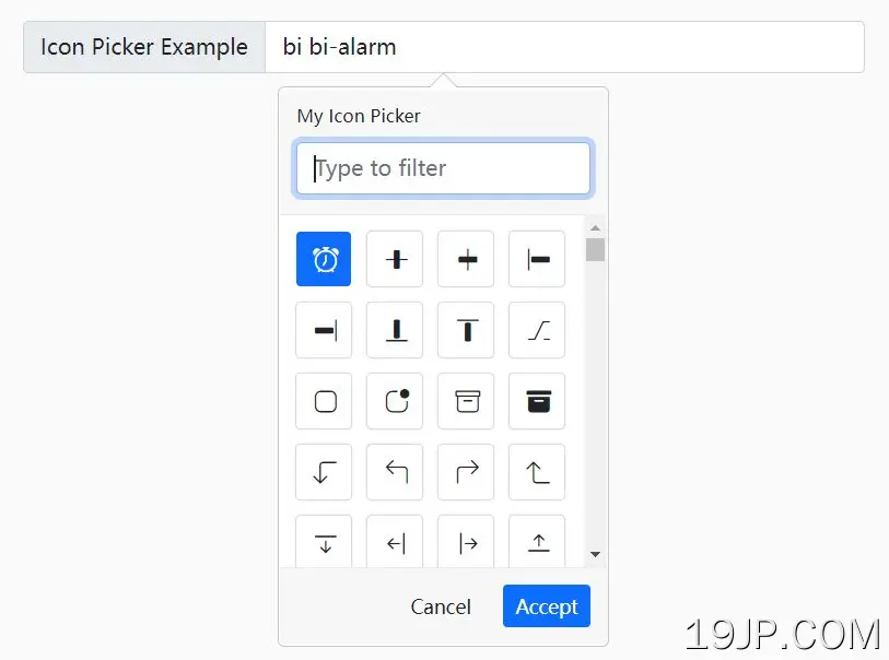 jQuery和Bootstrap 5 可自定义Bootstrap图标选择器