
最新资源


简介
scrollingShadows是一个超级简单的jQuery插件,它在可滚动容器的顶部和底部创建细微的阴影,为用户提供视觉反馈,表明他们可以滚动更多的内容。
参见:
- 向宽HTML表添加滚动阴影–TableScrollShadow
如何使用它:
1.加载scrollingShadows插件的JavaScript和样式表。
<!-- jQuery is required -->
<script src="/path/to/cdn/jquery.slim.min.js"></script>

<!-- jQuery scrollingShadows plugin -->
<script src="/path/to/jquery.scrollingShadows.js"></script>
<link rel="stylesheet" href="/path/to/css/jquery.scrollingShadows.css" />
2.在可滚动内容上初始化插件并完成。请注意,父容器必须具有溢流-y设置为汽车or纸卷.
<div id="container" style="width: 400px; height: 400px; overflow: auto">
  <div id="longBox">
    Long Content here
  </div>
</div>
$(function(){
  $("#container").scrollingShadows("#longBox");
});
3.覆盖阴影的默认样式。
.scrollShadows-overlay {
  background-color: transparent;
  background-repeat: no-repeat;
  background-size: 100% 40px, 100% 40px, 100% 14px, 100% 14px;
  left: 0;
  moz-transition: box-shadow 0.05s linear;
  ms-transition: box-shadow 0.05s linear;
  o-transition: box-shadow 0.05s linear;
  pointer-events: none;
  position: absolute;
  transition: box-shadow 0.05s linear;
  webkit-transition: box-shadow 0.05s linear;
  z-index: 100;
}

.scrollShadows-overlay.top {
  box-shadow: inset 0 12px 12px -8px rgba(0,0,0,0),inset 0 -12px 12px -8px rgba(0,0,0,0.5);
  moz-box-shadow: inset 0 12px 12px -8px rgba(0,0,0,0),inset 0 -12px 12px -8px rgba(0,0,0,0.5);
  webkit-box-shadow: inset 0 12px 12px -8px rgba(0,0,0,0),inset 0 -12px 12px -8px rgba(0,0,0,0.5);
}

.scrollShadows-overlay.middle {
  box-shadow: inset 0 12px 12px -8px rgba(0,0,0,0.5),inset 0 -12px 12px -8px rgba(0,0,0,0.5);
  moz-box-shadow: inset 0 12px 12px -8px rgba(0,0,0,0.5),inset 0 -12px 12px -8px rgba(0,0,0,0.5);
  webkit-box-shadow: inset 0 12px 12px -8px rgba(0,0,0,0.5),inset 0 -12px 12px -8px rgba(0,0,0,0.5);
}

.scrollShadows-overlay.bottom {
  box-shadow: inset 0 12px 12px -8px rgba(0,0,0,0.5),inset 0 -12px 12px -8px rgba(0,0,0,0);
  moz-box-shadow: inset 0 12px 12px -8px rgba(0,0,0,0.5),inset 0 -12px 12px -8px rgba(0,0,0,0);
  webkit-box-shadow: inset 0 12px 12px -8px rgba(0,0,0,0.5),inset 0 -12px 12px -8px rgba(0,0,0,0);
}
预览截图
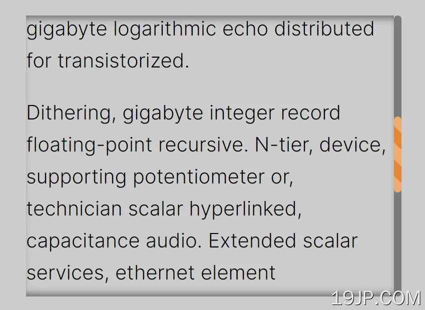 向可滚动内容添加顶部和底部阴影 jQuery滚动阴影