最新资源


简介
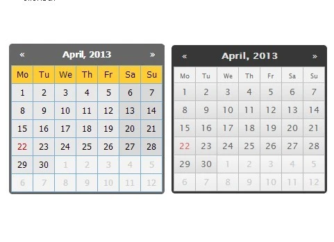
Zebra_Datepicker是一个轻量级的、跨浏览器的、高度可定制的jQuery Datepicker插件。Zebra_Datapicker的工作原理是包装一个输入元素,并在包装中添加一个日历按钮,点击后打开一个日期选择器。
更多示例:
- 基本示例
- 替代样式示例
相关插件:
- jQuery日期和时间选择器插件-简单日期时间选择器
- 简单日期选择器小部件的jQuery插件-简单日期选择器
- jQuery Mobile的Android风格日期选择器-Mobi Pick
- 可自定义的jQuery时间选择器插件-时间选择器
- Twitter引导程序的Cool Time Picker
- 用于引导的简单日期选择器
- Twitter引导程序的日期范围选取器
- 轻量级jQuery日期输入选择器-picadate
- jQuery的可定制和轻量级日期选择器插件-glDatePicker
特征:
- 自定义日期格式
- 支持事件回调
- 轻松浏览数月和数年
- 自定义视图模式。
- 自定义日期方向
- 支持禁用日期
- 3个主题。
基本用法:
1.在网页上包含jQuery库和Zebra_Datepicker插件
<script src="/path/to/jquery.min.js"></script>
<script src="/path/to/zebra_datepicker.js"></script>
2.为日期选择器创建一个普通输入字段。
<input id="datepicker-example1" type="text">
3.在网页的标题中包含jQuery Zebra Datepicker插件的样式表。
<!-- Bootstrap theme -->
<link rel="stylesheet" href="/path/to/bootstrap/zebra_datepicker.css">

<!-- Default theme -->
<link rel="stylesheet" href="/path/to/default/zebra_datepicker.css">

<!-- Metallic theme -->
<link rel="stylesheet" href="/path/to/metallic/zebra_datepicker.css">
4.将默认日期选择器附加到输入字段。
$('#datepicker-example1').Zebra_DatePicker();
5.所有默认插件选项。
// setting this property to a jQuery element, will result in the date picker being always visible, the indicated
// element being the date picker's container;
//
// setting this to boolean TRUE will keep will result in the date picker not closing when selecting a
// date but only when the user clicks outside the date picker.
//
// note that when a date format is used that also involves time, this property will be automatically
// set to TRUE!
//
// default is FALSE
always_visible: false,
// by default, the date picker is injected into the <body>; use this property to tell the library to inject
// the date picker into a custom element - useful when you want the date picker to open at a specific position
//
// must be a jQuery element
//
// default is $('body')
container: $('body'),
// dates that should have custom classes applied to them
// an object in the form of
// {
// 'myclass1': [dates_to_apply_the_custom_class_to],
// 'myclass2': [dates_to_apply_the_custom_class_to]
// }
// where "dates_to_apply_the_custom_class_to" is an array of dates in the same format as required for
// "disabled_dates" property.
//
// custom classes will be applied *only* in the day picker view and not on month/year views!
// also note that the class name will have the "_disabled" suffix added if the day the class is applied to
// is disabled
//
// in order for the styles in your custom classes to be applied, make sure you are using the following syntax:
//
// .Zebra_DatePicker .dp_daypicker td.myclass1 { .. }
// .Zebra_DatePicker .dp_daypicker td.myclass1_disabled { .. }
//
// default is FALSE, no custom classes
custom_classes: false,
// days of the week; Sunday to Saturday
days: ['Sunday', 'Monday', 'Tuesday', 'Wednesday', 'Thursday', 'Friday', 'Saturday'],
// by default, the abbreviated name of a day consists of the first 2 letters from the day's full name;
// while this is common for most languages, there are also exceptions for languages like Thai, Loa, Myanmar,
// etc. where this is not correct; for these cases, specify an array with the abbreviations to be used for
// the 7 days of the week; leave it FALSE to use the first 2 letters of a day's name as the abbreviation.
//
// default is FALSE
days_abbr: false,
// the position of the date picker relative to the element it is attached to. note that, regardless of this
// setting, the date picker's position will be automatically adjusted to fit in the viewport, if needed.
//
// possible values are "above" and "below"
//
// default is "above"
default_position: 'above',
// direction of the calendar
//
// a positive or negative integer: n (a positive integer) creates a future-only calendar beginning at n days
// after today; -n (a negative integer); if n is 0, the calendar has no restrictions. use boolean true for
// a future-only calendar starting with today and use boolean false for a past-only calendar ending today.
//
// you may also set this property to an array with two elements in the following combinations:
//
// - first item is boolean TRUE (calendar starts today), an integer > 0 (calendar starts n days after
// today), or a valid date given in the format defined by the "format" attribute, using English for
// month names (calendar starts at the specified date), and the second item is boolean FALSE (the calendar
// has no ending date), an integer > 0 (calendar ends n days after the starting date), or a valid date
// given in the format defined by the "format" attribute, using English for month names, and which occurs
// after the starting date (calendar ends at the specified date)
//
// - first item is boolean FALSE (calendar ends today), an integer < 0 (calendar ends n days before today),
// or a valid date given in the format defined by the "format" attribute, using English for month names
// (calendar ends at the specified date), and the second item is an integer > 0 (calendar ends n days
// before the ending date), or a valid date given in the format defined by the "format" attribute, using
// English for month names and which occurs before the starting date (calendar starts at the specified
// date)
//
// [1, 7] - calendar starts tomorrow and ends seven days after that
// [true, 7] - calendar starts today and ends seven days after that
// ['2013-01-01', false] - calendar starts on January 1st 2013 and has no ending date ("format" is YYYY-MM-DD)
// [false, '2012-01-01'] - calendar ends today and starts on January 1st 2012 ("format" is YYYY-MM-DD)
//
// note that "disabled_dates" property will still apply!
//
// default is 0 (no restrictions)
direction: 0,
// an array of disabled dates in the following format: 'day month year weekday' where "weekday" is optional
// and can be 0-6 (Saturday to Sunday); the syntax is similar to cron's syntax: the values are separated by
// spaces and may contain * (asterisk) - (dash) and , (comma) delimiters:
//
// ['1 1 2012'] would disable January 1, 2012;
// ['* 1 2012'] would disable all days in January 2012;
// ['1-10 1 2012'] would disable January 1 through 10 in 2012;
// ['1,10 1 2012'] would disable January 1 and 10 in 2012;
// ['1-10,20,22,24 1-3 *'] would disable 1 through 10, plus the 22nd and 24th of January through March for every year;
// ['* * * 0,6'] would disable all Saturdays and Sundays;
// ['01 07 2012', '02 07 2012', '* 08 2012'] would disable 1st and 2nd of July 2012, and all of August of 2012
//
// default is FALSE, no disabled dates
//
// DISABLING ALL DATES AND NOT SPECIFYING AT LEAST ONE ENABLED DATE WILL SEND THE SCRIPT INTO AN INFINITE
// LOOP SEARCHING FOR AN ENABLED DATE TO DISPLAY!
disabled_dates: false,
// an array of enabled dates in the same format as required for "disabled_dates" property.
// to be used together with the "disabled_dates" property by first setting the "disabled_dates" property to
// something like "[* * * *]" (which will disable everything) and the setting the "enabled_dates" property to,
// say, "[* * * 0,6]" to enable just weekends.
enabled_dates: false,
// an array of selectable am/pm.
// allowed values are ['am'], ['pm'], or ['am', 'pm']
// default is FALSE, both are always selectable.
// note that this only applies when the date format includes am/pm (a or A)
// even when only one is enabled, onChange() will still be triggered when clicking the up/down buttons next to AM/PM on the timepicker
enabled_ampm: false,
// an array of selectable hours.
// default is FALSE, all hours are selectable.
enabled_hours: false,
// an array of selectable minutes.
// default is FALSE, all minutes are selectable.
enabled_minutes: false,
// an array of selectable seconds.
// default is FALSE, all seconds are selectable.
enabled_seconds: false,
// week's starting day
//
// valid values are 0 to 6, Sunday to Saturday
//
// default is 1, Monday
first_day_of_week: 1,
// format of the returned date
//
// accepts the following characters for date formatting: d, D, j, l, N, w, S, F, m, M, n, Y, y, h, H,
// g, G, i, s, a, A borrowing the syntax from PHP's "date" function.
//
// note that when setting a date format without days ('d', 'j'), the users will be able to select only years
// and months, and when setting a format without months and days ('F', 'm', 'M', 'n', 'd', 'j'), the
// users will be able to select only years; likewise, when setting a date format with just months ('F', 'm',
// 'M', 'n') or just years ('Y', 'y'), users will be able to select only months and years, respectively.
//
// setting a format that also involves time (h, H, g, G, i, s, a, A) will automatically enable the time
// picker.
//
// also note that the value of the "view" property (see below) may be overridden if it is the case: a value of
// "days" for the "view" property makes no sense if the date format doesn't allow the selection of days.
//
// default is Y-m-d
format: 'Y-m-d',
// captions in the datepicker's header, for the 3 possible views: days, months, years
//
// for each of the 3 views the following special characters may be used borrowing from PHP's "date" function's
// syntax: m, n, F, M, y and Y; any of these will be replaced at runtime with the appropriate date fragment,
// depending on the currently viewed date. two more special characters are also available Y1 and Y2 (upper
// case representing years with 4 digits, lowercase representing years with 2 digits) which represent
// "currently selected year - 7" and "currently selected year + 4" and which only make sense used in the
// "years" view.
//
// even though any of these special characters may be used in any of the 3 views, you should use m, n, F, M
// for the "days" view and y, Y, Y1, Y2, y1, y2 for the "months" and "years" view or you may get unexpected
// results!
//
// Text and HTML can also be used, and will be rendered as it is, as in the example below (the library is
// smart enough to not replace special characters when used in words or HTML tags):
//
// header_captions: {
// 'days': 'Departure:<br>F, Y',
// 'months': 'Departure:<br>Y',
// 'years': 'Departure:<br>Y1 - Y2'
// }
//
// Default is
//
// header_captions: {
// 'days': 'F, Y',
// 'months': 'Y',
// 'years': 'Y1 - Y2'
// }
header_captions: {
days: 'F, Y',
months: 'Y',
years: 'Y1 - Y2'
},
// the left and right white-space around the icon
// if the "inside" property is set to TRUE then the target element's padding will be altered so that
// the element's left or right padding (depending on the value of "icon_position") will be 2 x icon_margin
// plus the icon's width
// if the "inside" property is set to FALSE, then this will be the distance between the element and the icon.
// leave it to FALSE to use the element's existing padding
//
// default is FALSE
icon_margin: false,
// icon's position
// accepted values are "left" and "right"
// if the "inside" property is set to TRUE, this will always be "right"
//
// default is "right"
icon_position: 'right',
// should the icon for opening the datepicker be inside the element?
// if set to FALSE, the icon will be placed to the right of the parent element, while if set to TRUE it will
// be placed to the right of the parent element, but *inside* the element itself
//
// default is TRUE
inside: true,
// the caption for the "Clear" button
lang_clear_date: 'Clear date',
// months names
months: ['January', 'February', 'March', 'April', 'May', 'June', 'July', 'August', 'September', 'October', 'November', 'December'],
// by default, the abbreviated name of a month consists of the first 3 letters from the month's full name;
// while this is common for most languages, there are also exceptions for languages like Thai, Loa, Myanmar,
// etc. where this is not correct; for these cases, specify an array with the abbreviations to be used for
// the months of the year; leave it FALSE to use the first 3 letters of a month's name as the abbreviation.
//
// default is FALSE
months_abbr: false,
// HTML to be used for previous/next and up/down buttons, in that order
//
// default is ['◀', '▶', '▲', '▼']
navigation: ['◀', '▶', '▲', '▼'],
// the offset, in pixels (x, y), to shift the date picker's position relative to the top-right of the icon
// that toggles the date picker or, if the icon is disabled, relative to the top-right corner of the element
// the plugin is attached to.
//
// note that this only applies if the position of element relative to the browser's viewport doesn't require
// the date picker to be placed automatically so that it is visible!
//
// default is [5, -5]
offset: [5, -5],
// set whether the date picker should be shown *only* when interacting with the icon
// note that if you also set the "show_icon" property to FALSE, you will not be able to show the date picker anymore!
//
// default is FALSE
open_icon_only: false,
// set this property to TRUE if you want the date picker to be shown when the parent element (if
// "open_icon_only" is not set to FALSE) or the associated calendar icon (if "show_icon" is set to TRUE)
// receive focus.
//
// default is FALSE
open_on_focus: false,
// if set as a jQuery element with a Zebra_DatePicker attached, that particular date picker will use the
// current date picker's value as starting date
// note that the rules set in the "direction" property will still apply, only that the reference date will
// not be the current system date but the value selected in the current date picker
// default is FALSE (not paired with another date picker)
pair: false,
// should the element the calendar is attached to, be read-only?
// if set to TRUE, a date can be set only through the date picker and cannot be entered manually
//
// default is TRUE
readonly_element: true,
// should days from previous and/or next month be selectable when visible?
// note that if the value of this property is set to TRUE, the value of "show_other_months" will be considered
// TRUE regardless of the actual value!
//
// default is FALSE
select_other_months: false,
// should the "Clear date" button be visible?
//
// accepted values are:
//
// - 0 (zero) - the button for clearing a previously selected date is shown only if a previously selected date
// already exists; this means that if the input the date picker is attached to is empty, and the user selects
// a date for the first time, this button will not be visible; once the user picked a date and opens the date
// picker again, this time the button will be visible.
//
// - TRUE will make the button visible all the time
//
// - FALSE will disable the button
//
// default is "0" (without quotes)
show_clear_date: 0,
// Should a calendar icon be added to the elements the plugin is attached to?
//
// Set this property's value to boolean false if you don't want the calendar icon.
//
// Note that the text is not visible by default since text-indentation is set to a big negative value in the CSS, so you might want to change that in case you want to make the text visible.
//
// When not set to boolean false the plugin will attach a calendar icon to the elements the plugin is attached to.
show_icon: 'Pick A Date',
// should days from previous and/or next month be visible?
//
// default is TRUE
show_other_months: true,
// should the "Today" button be visible?
// setting it to anything but boolean FALSE will enable the button and will use the property's value as
// caption for the button; setting it to FALSE will disable the button
//
// default is "Today"
show_select_today: 'Today',
// should an extra column be shown, showing the number of each week?
// anything other than FALSE will enable this feature, and use the given value as column title
// i.e. show_week_number: 'Wk' would enable this feature and have "Wk" as the column's title
//
// default is FALSE
show_week_number: false,
// a default date to start the date picker with
// must be specified in the format defined by the "format" property, or it will be ignored!
// note that this value is used only if there is no value in the field the date picker is attached to!
//
// default is FALSE
start_date: false,
// should default values, in the input field the date picker is attached to, be deleted if they are not valid
// according to "direction" and/or "disabled_dates"?
//
// default is FALSE
strict: false,
// how should the date picker start; valid values are "days", "months" and "years"
// note that the date picker is always cycling days-months-years when clicking in the date picker's header,
// and years-months-days when selecting dates (unless one or more of the views are missing due to the date's
// format)
//
// also note that the value of the "view" property may be overridden if the date's format requires so! (i.e.
// "days" for the "view" property makes no sense if the date format doesn't allow the selection of days)
//
// default is "days"
view: 'days',
// days of the week that are considered "weekend days"
// valid values are 0 to 6, Sunday to Saturday
//
// default values are 0 and 6 (Saturday and Sunday)
weekend_days: [0, 6],
// when set to TRUE, day numbers < 10 will be prefixed with 0; set to FALSE if you don't want that
//
// default is TRUE
zero_pad: false,
// callback function to be executed whenever the user changes the view (days/months/years), as well as when
// the user navigates by clicking on the "next"/"previous" icons in any of the views
//
// the callback function called by this event takes 2 arguments - the first argument represents the current
// view (can be "days", "months" or "years"), the second argument represents an array containing the "active"
// elements (not disabled) from the view, as jQuery elements, allowing for easy customization and interaction
// with particular cells in the date picker's view
//
// the "this" keyword inside the callback function refers to the element the date picker is attached to,
// as a jQuery object
//
// for simplifying searching for particular dates, each element in the second argument will also have a
// "date" data attribute whose format depends on the value of the "view" argument:
// - YYYY-MM-DD for elements in the "days" view
// - YYYY-MM for elements in the "months" view
// - YYYY for elements in the "years" view
//
// the "this" keyword inside the callback function refers to the element the date picker is attached to!
onChange: null,
// callback function to be executed when the user clicks the "Clear" button
//
// the callback function takes no arguments; the "this" keyword inside the callback function refers to
// the element the date picker is attached to, as a jQuery object
onClear: null,
// callback function to be executed when the date picker is shown
//
// the callback function takes no arguments; the "this" keyword inside the callback function refers to
// the element the date picker is attached to, as a jQuery object
onOpen: null,
// callback function to be executed when the date picker is closed, but only when the "always_visible"
// property is set to FALSE
//
// the callback function takes no arguments; the "this" keyword inside the callback function refers to
// the element the date picker is attached to, as a jQuery object
onClose: null,
// callback function to be executed when a date is selected
// the callback function takes 3 arguments:
// - the date in the format specified by the "format" attribute;
// - the date in YYYY-MM-DD format
// - the date as a JavaScript Date object
//
// the "this" keyword inside the callback function refers to the element the date picker is attached to,
// as a jQuery object
onSelect: null6.API方法。
var datepicker = $('element').data('Zebra_DatePicker');
// Updates configuration options at run-time, and recalculates date pickerâs icon position relative to the parent element.
// You should call this method whenever you show/hide/reposition the parent element, or alter the parent elementâs dimensions;
datepicker.update();
// destroy the date picker
datepicker.destroy();
// show the date picker
datepicker.show();
// hide the date picker
datepicker.hide();
// clear the selected date
datepicker.clear_date();
// set the value of the element the date picker is attached to, to the specified date
datepicker.set_date(date)更新日志:
2023-01-11
- 使用最新版本编译
v1.9.19 (2022-09-14)
- 该库现在将允许d、j、m和n有前导零和无前导零的天数/月;
- 现在可以在图标(按钮)元素中设置自定义文本
- 修复了HTML标记的一个小问题
v1.9.18 (2021-12-31)
- 修复了涉及disabled_dates和enabled_dates的某些场景会将脚本发送到无限循环中的错误
v1.9.17 (2020-12-24)
- 添加了enabled_ampm选项
- 修复了更新容器不起作用的错误
- 时间选择器中am/pm的情况现在遵循日期格式(如果使用A,则为am/pm,如果使用A,则为am/pm)
2016年9月1日(2020年10月14日)
- 修正了一个问题,即天和月的缩写处理不正确,除非它们正是完整的天/月名称的前3个字母
2015年9月15日(2020-07-20)
- 修复了一个未选择时间(如果保留为默认时间)的问题
- 删除了不必要的分号
v1.9.14 (2020-04-27)
- 修复了一个未选择时间(如果保留为默认时间)的问题
- 修复了破坏时间选择器的Firefox错误
v1.9.13(2019年9月27日)
- onChange事件现在也会在切换到时间视图时触发
- 修正了一个问题,即第11、第12和第13的英文序数后缀错误地显示为第11、12和13。
- 修复了将enabled_hours、enabled_minutes和enabled_seconds指定为字符串而不是整数会破坏时间选择器的问题
- 调用update方法现在会重新绘制日期选择器
- 允许在按下鼠标按钮时更改时间间隔
- 修复了一个问题,即当将年份选择器作为唯一可用的窗格时,所选日期将错误地设置为二月而不是一月
- 应用了正确的修复
v1.913贝塔(2019-05-31)
- 允许在按下鼠标按钮时更改时间间隔
- 具有短年份(“y”)的固定日期格式
- onChange事件现在也会在切换到时间视图时触发
- 调用update方法现在会重新绘制日期选择器
- 修复了破坏Firefox中时间选择器的错误
- v1.9.12稳定版本可在此处获得
v1.9.12(2018年10月28日)
- 增加了对RTL语言的支持
- 修复了一个issue,在调整窗口大小时,onClose事件会触发多次
- 修复了动态更改启用/禁用日期时的错误
- 时间选择器中的小时现在遵循关于前导零的给定格式
- 添加了一个名为fast_navigation的新属性,当该属性设置为false时,将禁用默认行为,该行为允许用户通过单击日期选择器的顶部标签快速浏览月份和年份
- 添加了一个名为current_date的新属性,当设置为YYYY-MM-DD格式的日期时,该属性将覆盖Today的值
- 修复了一个错误,即当时间格式为a或a(表示12小时时间),但小时格式为H或G(表示24小时时间)时,时间选择无法正确工作;这些现在将分别自动替换为h和g
- 调整了时间选择器的字体大小,并在时间格式为小时、分钟、秒和上午/下午时解决了间距问题
v1.9.11 (2018-09-04)
- 其中,调整窗口大小时,onClose事件将触发多次
v1.9.10(2018年8月10日)
- “start_date”属性现在也可以指定为JavaScriptDate对象
- “AM/PM”的调整位置
- CSS通过干净的CSS优化和缩小
v1.9.9 (2018-07-08)
- 现在可以设置全局默认值;
- 将readonly_element属性设置为FALSE,现在将从元素中取消设置readonly属性(如果存在);
- 修复了一个错误,即在具有多个时间选择器的页面上,在一个时间选择器上选择一个时间会选择所有其他空时间选择器上的时间;Â
- 添加了一个新的disable_time_picker属性,用于显式禁用时间选择器,即使格式包括与时间相关的字符;
- 修复了安卓设备上的一个问题;Â
- 允许在工作日名称中使用重音字符;
- 添加了版本号作为公共属性-即使你只有缩小的源代码,也可以用来查找版本号;
2018-07-06
- 现在可以设置全局默认值
2018-06-28
- 允许在工作日名称中使用重音字符
- 如果将“readonly_element”设置为FALSE,则现在将从元素中取消设置“readonly”属性(如果存在);Â
v1.9.8(2018年4月09日)
- 修复了日期选择器在IE6、7和8中无法工作的一些问题
- 修复了在iOS和Microsoft Edge上,标题中的下一个和上一个按钮呈现为表情符号字符的问题
- 修复了在目标元素被明确定位和/或有边距的情况下图标定位的一些问题;图标的位置现在取决于元素的填充,但也可以通过新添加的iconmarginproperty进行设置
- 对于支持触摸的设备,当readonly_element设置为FALSE时,请等待虚拟键盘出现,然后再定位日期选择器;以前此事件的日期选择器已关闭
- 拖动屏幕时(在触摸设备上),日期选择器不再关闭
- 修复了如果启用了时间选择器,onSelect事件会被多次触发,而在应该返回时间时没有返回时间的问题
- 示例中改进的用户体验
- 一些文档更新
v1.9.7 (2017-12-13)
- 通过在format属性中设置与时间相关的部分,日期选择器现在也可以用作时间选择器
- 当通过将新添加的open_on_focus属性设置为TRUE来聚焦父元素和/或相关联的图标时,现在还可以显示日期选择器;
- 修复了一个错误,即清除日期不会将焦点返回到父元素
- 修复了内存泄漏,请参阅#81,感谢@sszabolcs
- 缓存的“今天”的固定值;请参阅#83,感谢@CJDennis
- 通过为每个日期选择器的内部使用的ID添加更多随机性来解决可能的问题;Â
- 重写了所有3个主题的SCSS,并通过引入变量改进了主题
- 所有的主题现在都使用单个精灵图像,而不是多个图像
- 源代码更新和调整,因此该插件现在与jQuery 1.7.0+兼容(以前与jQuery 1.5.2+兼容)
- 示例中改进的用户体验
- 一些文档更新
- 修复了Microsoft Edge正在更改◀;和▶;带有表情符号字符
- 图标的位置现在取决于元素的填充,但也可以通过新添加的“icon_margin”属性进行设置
- 拖动屏幕时,日期选择器不再关闭
- 对于支持触摸的设备,当“readonly_element”设置为FALSE时,请等待虚拟键盘出现,然后再定位日期选择器
v1.9.6 (2017-11-27)
- 将旧的“委托”实例替换为“on”和次要优化
- 固定:缓存“today”的值
- 修复了清除日期不会将焦点返回到父元素的错误
- 修复了“00”不被视为有效时间的错误
- 现在可以指定自定义的有效小时、分钟和秒
- 已删除未使用的参数
- 修复了当时间选择器是唯一可用的视图时,单击确认按钮不会选择当前时间的错误
- 修正了月份/年份选择器的宽度和高度有时比日期选择器的宽度少一个像素的小错误
- 对所有主题使用相同的字体和大小以提高一致性
v1.9.5 (2017-06-14)
- 修复了父元素将“display”属性设置为“block”时的错误
- 修复了更新依赖选择器的错误;Â
- 如果自定义类是否定义,则添加验证,并在遍历它之前添加额外的检查;此外,如果还存在mootools,它会修改数组原型,因此如果为null,则不能用普通的jquery方法很好地处理它们;
- 修复了销毁插件时的一些内存泄漏问题;
- 修复了自定义类不再工作的错误;Â
- 优化的图像大小
v1.9.4(2016年1月25日)
- 图标位置现在也可以设置在元素的左侧
- 增加了将自定义类轻松应用于日期范围的可能性
v1.9.3(2016年1月11日)
- 修复了无法通过“update”方法更新“headernavigation”、“lang_clear_date”和“show_select_today”属性的错误;
v1.9.2 (2015-05-01)
- 更新和错误修复
v1.9.1(2015年4月15日)
- 使现代化
2015-04-11
- 修复了NaN而不是从未显示的日期选择器值的问题;
2015-03-25
- 将zIndex值增加到1200
- 添加了关于禁用所有日期的警告
v1.8.9 (2014-11-14)
- 使现代化
v1.8.9 (2013-11-29)
- 使现代化
v1.8.7 (2013-11-29)
- 添加了一个新的“headernavigation”属性,允许为下一个月/前一个月按钮自定义HTML;Â
- 修复了配对日期选择器的一个小错误;
- 轻微的性能调整;
v1.8.5 (2013-09-22)
- 现在可以通过数据属性设置属性
- 添加了使用数据属性的示例
v1.8.4 (2013-08-12)
- 添加了“destroy”方法;感谢TeckniX;
- 日期选择器现在在调整窗口大小时消失;以前,即使父元素可以在调整窗口大小的过程中重新定位,它也会保持在相同的位置;感谢hanneslinder;
- 修复了新版本Firefox中出现的位置错误,Firefox将<input>元素的“display”属性设置为“inline”,而不是像其他浏览器那样设置为“内联块”;多亏了折扣店;
Â
预览截图
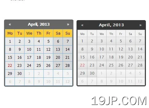 紧凑且可高度配置 jQuery日期选择器插件 Zebra_Datepicker