最新资源


简介
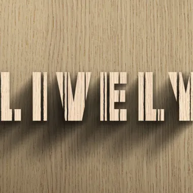
使用CSS文本阴影属性和一点jQuery创建一个逼真的交互式阴影,该阴影看起来会落在你的鼠标指针所在的位置,并创建一个文本落在另一个文本后面的错觉。
如何使用它:
1.将文本添加到页面中。
- <!-- Shadow Text -->
- <div class="shadow-text lighter">
- jQuery
- </div>
- <div class="shadow-text bolder">
- jQuery
- </div>
- <!-- Foreground Text -->
- <div class="shadow-text text"></div>
2.文本阴影所需的CSS。
- .shadow-text {
- font-size: 270px;
- letter-spacing: 0.2em;
- width: 100vw;
- position: absolute;
- top: 50%;
- left: calc(50% + 15px);
- transform: translate(-50%, -50%);
- display: flex;
- align-items: center;
- justify-content: center;
- }
- .shadow-text.lighter {
- mix-blend-mode: multiply;
- z-index: 2;
- color: transparent;
- opacity: 0.9;
- text-shadow: 0px 0px 10px #1e1e1e;
- }
- .shadow-text.bolder {
- transform: translate(-50%, -50%) scale(1);
- filter: blur(10px);
- color: #fff;
- mix-blend-mode: multiply;
- z-index: 1;
- color: transparent;
- opacity: 0.35;
- }
- .shadow-text.text {
- background-image: url("/path/to/text.png");
- background-repeat: no-repeat;
- background-position: stretch;
- background-size: contain;
- z-index: 10;
- position: absolute;
- top: 50%;
- left: 50%;
- height: 200px;
- width: 864px;
- transform: translate(-50%, -50%);
- text-shadow: none;
- color: #fff;
- }
3.在文档末尾加载所需的jQuery库。
- <script src="/path/to/cdn/jquery.slim.min.js"></script>
4.检测鼠标移动事件并根据光标位置将阴影应用于文本的主jQuery脚本。
- $(function () {
- let $shadow = $(".text");
- let $shadowLighter = $(".lighter");
- let $shadowBolder = $(".bolder");
- //let shadowMax = $(window).innerHeight();
- let shadowMax = 450;
- let shadowMin = shadowMax * -1;
- let shadowMidPoints = [
- $shadow.offset().left + $shadow.width() / 2,
- $shadow.offset().top + $shadow.height() / 2
- ];
- let shadowSteps = 20;
- var shadowBlur = 10;
- $(document).on("mousemove", (e) => {
- let shadowX = Math.min(
- shadowMax,
- Math.max(shadowMin, shadowMidPoints[0] - e.pageX)
- );
- let shadowY = Math.min(
- shadowMax,
- Math.max(shadowMin, shadowMidPoints[1] - e.pageY)
- );
- var shadowValue;
- var shadowValueBolder;
- var shadowOpacity;
- var shadowOpacityBolder;
- for (var i = 0; i < shadowSteps; i++) {
- var newOffsetX = Math.floor(((shadowX / 2) * i) / 50);
- var newOffsetY = Math.floor(((shadowY / 2) * i) / 50);
- shadowOpacity = 1 - shadowSteps * i * 0.002;
- shadowOpacityBolder = 1 - shadowSteps * i * 0.005;
- shadowBlur = i * 1.5;
- if (shadowValue === undefined) {
- shadowValue = "0px 0px " + 10 + "px rgba(20, 17, 15, 0.3)";
- shadowValueBolder = "0px 0px " + 10 + "px rgba(20, 17, 15, 1)";
- } else {
- shadowValue +=
- ", " +
- newOffsetX * 2 +
- "px " +
- newOffsetY * 2 +
- "px " +
- shadowBlur * 1.25 +
- "px rgba(20, 17, 15, " +
- shadowOpacity / 5 +
- ")";
- shadowValueBolder +=
- ", " +
- newOffsetX * 0.25 +
- "px " +
- newOffsetY * 0.25 +
- "px " +
- shadowBlur * 1.5 +
- "px rgba(20, 17, 15, " +
- shadowOpacityBolder / 5 +
- ")";
- }
- }
- $shadowLighter.css("text-shadow", shadowValue);
- $shadowBolder.css("text-shadow", shadowValueBolder);
- });
- });
预览截图
 jQuery和CSS 逼真交互式文本阴影