最新资源


简介
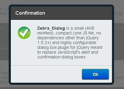
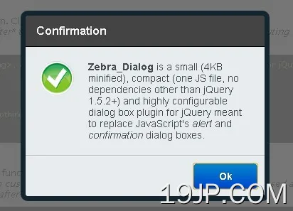
Zebra_Dialog是一个小型(缩小了4KB)、紧凑(一个JS文件,除了jQuery 1.5.2+之外没有其他依赖项)和高度可配置的jQuery对话框插件。它也可以用作网站或项目的通知小部件。
Zebra_Dialog可以生成6种类型的对话框:确认、信息、警告、提示、错误和问题。通过更改CSS文件,可以很容易地自定义对话框的外观。
Zebra_Dialog对话框可以放置在屏幕上的任何位置,而不仅仅是中间!默认情况下,可以通过按ESC键或单击覆盖上的任意位置来关闭对话框。它也可以用作网站或项目的通知小部件。
根据GNU宽松通用公共许可证v3.0许可。
您可能还喜欢:
- 用于Bootstrap的jQuery对话框插件-Bootbox
- 现代模态对话框-ModalBox
- 轻量级模态对话框插件-SimpleModal
- 模态对话框Windows插件-leanModal
- SimpleModal-漂亮的弹出窗口插件
基本用法:
1.在您的网页上包含jQuery库和jQuery Zebra_Dialog。
<script src="jquery.min.js"></script>
<script src="javascript/zebra_dialog.js"></script>
2.包含jQuery Zebra_Dialog来设计插件的样式。
<link rel="stylesheet" href="css/zebra_dialog.css" type="text/css">
3.Html标记。
<a href="javascript:void(0)" id="example1">here</a>
4.调用插件并完成。
// show a dialog box when clicking on a link
$('#example1').bind('click', function(e) {
  e.preventDefault();
  $.Zebra_Dialog('The link was clicked!');
});
5.可能的带有默认值的插件选项。
//  The speed, in milliseconds, by which the overlay and the
//  dialog box will be animated when closing.
animation_speed_hide: 250,

//  The speed, in milliseconds, by which the dialog box will
//  fade in when appearing.
animation_speed_show: 0,

//  The number of milliseconds after which to automatically
//  close the dialog box or FALSE to not automatically close the dialog box.
auto_close: false,

//  The index (0-based) of the button (from left to right) to
//  place the focus on when a dialog box is first shown.
//
//  Set to FALSE to disable. When set to FALSE the focus will
//  be placed on the dialog box's content so that when the
//  users presses TAB, the focus will be set on the first
//  button.
//
//  Setting this to TRUE is equivalent to setting it to 0.
auto_focus_button: true,

//  Use this for localization and for adding custom buttons.
//
//  If set to TRUE, the default buttons will be used, depending
//  on the type of the dialog box: ['Yes', 'No'] for "question"
//  type and ['Ok'] for the other dialog box types.
//
//  For custom buttons, use an array containing the captions of
//  the buttons to display: ['My button 1', 'My button 2'].
//
//  Set to FALSE if you want no buttons.
//
//  Note that when the dialog box is closed as a result of clicking
//  a button, the "onClose" event is triggered and the callback
//  function (if any) receives as argument the caption of the
//  clicked button.
//
//  See the comments for the "onClose" event below for more
//  information.
//
//  You can also attach callback functions to individual buttons
//  by using objects in the form of:
//
//  [
//   {caption: 'My button 1', callback: function() { // code }},
//   {caption: 'My button 2', callback: function() { // code }}
//  ]
//
//  The main difference is that a callback function attached this
//  way is executed as soon as the button is clicked rather than
//  *after* the dialog box is closed, as it is the case with the
//  "onClose" event.
//
//  Callback functions attached to buttons get as argument the
//  entire dialog box jQuery object.
//
//  A callback function returning FALSE will prevent the dialog
//  box from closing.

//  When set to TRUE, the buttons will be centered instead of
//  right-aligned.
buttons: true,

//  When set to TRUE, the buttons will be centered instead of
//  right-aligned.
center_buttons: false,

//  An extra class to add to the dialog box's container. Useful
//  for customizing a dialog box elements' styles at runtime.
//
//  For example, setting this value to "mycustom" and in the
//  CSS file having something like
//  .mycustom .ZebraDialog_Title { background: red }
//  would set the dialog box title's background to red.
//
//  See the CSS file for what can be changed.
custom_class: false,

//  By default, the height of the dialog box is automatically
//  set and it is also influenced by the "max_height" property.
//
//  Use this to set a fixed height, in pixels, for the dialog
//  box.
height: 0,

//  When set to TRUE, pressing the ESC key will close the dialog
//  box.
keyboard: true,

//  Margin of the dialog box relative to the viewport's limits
//  (a single value, applied both horizontally and/or vertically)
//
//  This is used when the dialog box is stretched 100% horizontally
//  and/or vertically and "width" and "max_width" are not set
//  (when stretched horizontally) and "height" and "max_height"
//  are not set (when stretched vertically).
//
//  Can be specified as a numeric value (which will be interpreted
//  as a value in pixels) or as a percentage (of the viewport).
//
//  Default is "0" - when stretched, the dialog box sticks to
//  the viewport's limits.
margin: 0,

//  The maximum height, in pixels, before the content in the
//  dialog box is scrolled.
//
//  If set to "0" the dialog box's height will automatically
//  adjust to fit the entire content.
max_height: 0,

//  The maximum width of the dialog box.
//
//  Can be specified as a numeric value (which will be interpreted
//  as a value in pixels) or as a percentage (of the viewport).
//
//  If "max_width" is set to valid value greater than 0,
//  then the "width" property will be ignored.
max_width: 450,

//  Default value to show in the input box when the dialog
//  box type is "prompt".
default_value: '',

//  The text (or HTML) to be displayed in the dialog box.
//
//  See the "source" property on how to add content via AJAX,
//  iFrames or from inline elements.
message: '',

//  When set to TRUE there will be a semitransparent overlay
//  behind the dialog box, preventing users from clicking
//  the page's content.
modal: true,

//  Should the dialog box close when the overlay is clicked?
overlay_close: true,

//  A selector indicating the DOM element to server as the overlay's container.
overlay_container: 'body',

//  The opacity of the overlay (between 0 and 1)
overlay_opacity: '.9',

//  Position of the dialog box.
//
//  Can be either "center" (which would center the dialog box) or
//  an array with 2 elements, in the form of
//  {'horizontal_position +/- offset', 'vertical_position +/- offset'}
//  (notice how everything is enclosed in quotes) where
//  "horizontal_position" can be "left", "right" or "center",
//  "vertical_position" can be "top", "bottom" or "middle", and
//  "offset" represents an optional number of pixels to add/substract
//  from the respective horizontal or vertical position.
//
//  Positions are relative to the viewport (the area of the
//  browser that is visible to the user)!
//
//  Examples:
//
//  ['left + 20', 'top + 20'] would position the dialog box in the
//  top-left corner, shifted 20 pixels inside.
//
//  ['right - 20', 'bottom - 20'] would position the dialog box
//  in the bottom-right corner, shifted 20 pixels inside.
//
//  ['center', 'top + 20'] would position the dialog box in
//  center-top, shifted 20 pixels down.
position: 'center',

//  The duration (in milliseconds) of the animation used to
//  reposition the dialog box when the browser window is resized.
reposition_speed:           500,

//  When set to TRUE, a "close" button (the little "x") will be
//  shown in the upper right corner of the dialog box.
//
//  If the dialog box has a title bar then the "close" button
//  will be shown in the title bar, vertically centered and
//  respecting the right padding.
//
//  If the dialog box does not have a title bar then the "close"
//  button will be shown in the upper right corner of the body
//  of the dialog box, respecting the position related properties
//  set in the stylesheet.
show_close_button: true,

//  Add content via AJAX, iFrames or from inline elements (together
//  with the already applied events).
//
//  This property can be any of the following:
//
//  - 'ajax': object - where "object" can be an object with any
//  of the properties you'd normally use to make an AJAX call in
//  jQuery (see the description for the "settings" argument at
//  http://api.jquery.com/jQuery.ajax/), or it can be a string
//  representing a valid URL whose content to be fetched via
//  AJAX and placed inside the dialog box.
//
//  Example:
//
//  source: {'ajax': 'http://myurl.com/'}
//
//  source: {'ajax': {
//      'url':      'http://myurl.com/',
//      'cache':    false
//  }}
//
//  Note that you cannot use the "success" property as it will
//  always be overwritten by the library; use the "complete"
//  property instead, if you have to!
//
//  - 'iframe': object - where "object" can be an object where
//  property names can be valid attributes of the <iframe> tag
//  (see https://developer.mozilla.org/en-US/docs/HTML/Element/iframe),
//  or it can be a string representing a valid URL to be loaded
//  inside an iFrame and placed inside the dialog box.
//
//  Example:
//
//  source: {'iframe': 'http://myurl.com/'}
//
//  source: {'iframe': {
//      'src':          'http://myurl.com/',
//      'width':        480,
//      'height':       320,
//      'scrolling':    'no'
//  }}
//
//  Note that you should always set the iFrame's width and height
//  and adjust the dialog box's "width" property accordingly!
//
//  - 'inline': selector - where "element" is a jQuery element
//  from the page; the element will be copied and placed inside
//  the dialog box together with any attached events! if you just
//  want the element's inner HTML, use $('#element').html().
//
//  Example:
//
//  source: {'inline': $('#myelement')}
source: false,

//  Title of the dialog box
title: '',

//  Dialog box type.
//
//  Can be any of the following:
//
//  - confirmation
//  - error
//  - information
//  - question
//  - warning
//  - prompt
//  If you don't want an icon, set the "type" property to FALSE.
//
//  By default, all types except "question" have a single button
//  with the caption "Ok"; type "question" has two buttons, with
//  the captions "Ok" and "Cancel" respectively.
type: 'information',

//  Should short messages be vertically centered?
vcenter_short_message:      true,

//  By default, the width of the dialog box is set in the CSS
//  file. Use this property to override the default width at
//  runtime.
//
//  Must be an integer, greater than 0. Anything else will instruct
//  the script to use the default value, as set in the CSS file.
//  Value should be no less than 200 for optimal output.
width: 0,

//  Event fired when *after* the dialog box is closed.
//
//  For executing functions *before* the closing of the dialog
//  box, see the "buttons" attribute.
//
//  The callback function (if any) receives as argument the
//  caption of the clicked button or boolean FALSE if the dialog
//  box is closed by pressing the ESC key or by clicking on the
//  overlay.
onClose: null
6.在对话框关闭后执行一个功能。
var dialog = new $.Zebra_Dialog('This is some information');

// First argument: the caption of the clicked button or boolean FALSE if the dialog box is closed by pressing the ESC key, by clicking the dialog box's x button, or by clicking the overlay. The argument can also be boolean TRUE when the dialog box type is prompt and the ENTER key is pressed while inside the input box.
// Second argument: receives the value entered in the input box - when the dialog box type is prompt and a button was clicked or the ENTER key was pressed while inside the input box, or undefined for any other case.
dialog.on('onClose', function(arguments){
  // do something
})
7.以编程方式隐藏/更新对话框。
var dialog = new $.Zebra_Dialog('This is some information');

dialog.close();
dialog.update();
更新日志:
2021-11-24
- 代码格式
3.0.5版(2020-08-19)
- 修复了使用iFrame时的错误
3.0.4版(2020-08-18)
- 修复了3.0.0中引入的disable_page_scrolling属性对没有滚动的页面产生不良影响的错误
版本3.0.3(2020-07-19)
- SASS文件现在可以在dist文件夹中使用
- 修复了重叠对话框的中断示例
3.0.2版(2020-04-26)
- 只在示例中添加屏幕截图的小版本
3.0.1版(2020-03-31)
- 修复了“center_buttons”属性在最新版本中不居中按钮的问题
v3.0.0(2019年9月04日)
- 打开的对话框后面的页面滚动现在默认禁用
- 添加了margin属性,以防止对话框在水平和/或垂直拉伸100%时触及视口的限制
- 添加了max_width属性,该属性与现有的max_height属性一起,现在可以指定为百分比
- 添加了用于提示类型对话框的default_value属性
- 宽度和高度属性现在也可以指定为百分比
- custom_class现在也被添加到覆盖中,而不仅仅是对话框中
- 当指定垂直位置(中间位置旁边)时,也可以使用单词中心
- 使用iFrame时,现在会自动计算宽度和高度,以适应对话框的宽度和高度;此外,现在在加载iFrame内容时还显示了一个微调器
- 现在,当打开多个模式对话框时,库会自动进行后台管理
- 放弃IE6支持
- 修复了对话框位置不正确的错误,它有边框
- 删除了backrop_container属性
- 对所有模板进行小调整
v2.1.1版本(2019-06-04)
- 添加了提示对话框类型
- 添加了用于为对话框设置自定义高度的高度属性
- 添加了更新方法,用于在运行时动态更改内容时调整对话框的位置
- 通过新添加的overlay_container属性,覆盖现在可以拥有与body元素不同的父元素
v2.1.0版本(2019-06-04)
- 在以前的提交中中断的固定高度
v2.0.0版本(2018-08-01)
- 添加了一个新的“auto_focus_button”属性,用于指示首次显示对话框时要放置焦点的按钮
- 简化对话框的HTML标记和指示对话框的各种状态/设置的所有类现在都添加到了主容器中
- 以前在JavaScript中完成的一些对齐现在在CSS中完成,但仍在IE6中工作:)
- 完全重写了主题的CSS,我们现在使用干净的CSS来优化CSS输出,导致平面主题减少了0.5KB,经典主题减少了1.8KB
- 添加了一个新的实体化主题,灵感来自谷歌材料设计
v1.6.0 (2018-07-26)
- “警告”对话框现在有“是”和“否”按钮,而不仅仅是“确定”按钮
- 将“确认”对话框上按钮的标签从“是”和“否”更改为“确定”和“取消”
- 修改后的示例页面
v1.5.0 (2018-07-05)
- 修复了对话框中的输入永远无法集中在移动设备上的错误
- 修复了插件在IE8中不工作的问题
- 自定义类现在可以添加到按钮中
- 添加了版本号作为公共属性-即使您只有缩小的源代码,也有助于查找版本号
2018-07-04
- 自定义类现在可以添加到按钮中
v1.4.1 (2017-10-14)
- 修复了对话框高度可能超过视口高度的错误
- 修复了iPhone上的滚动
v1.4.0(2016年6月28日)
- 性能改进和源代码调整
- 新文件夹结构
- 对话框现在在小屏幕上有100%的宽度
v1.3.12 (2016-06-01)
- 修复了“关闭”按钮的定位问题
v1.3.8 (2013-12-21)
- 修复了一个错误
v1.3.7 (2013-11-26)
- 添加了新的“平面”主题
v1.3.6 (2013-10-17)
- 固定参考
- 修复了2个错误
v1.3.3 (2013-05-29)
- 现在可以从CSS设置覆盖和对话框的z索引值。以前,这些都是在JavaScript代码中设置的,需要破解源代码才能更改它们;
v1.3.2 (2013-05-27)
- 修复了一个错误,即如果“reposition_speed”属性>0,并且手动调整浏览器窗口的大小,则用于重新定位窗口的动画将排队,并将进程减慢到几乎完全停止;
- 将“animaton_speed”属性的名称更改为“animation_speed_hide”,并添加了一个新的“animatia_speed_show”,用于设置对话框出现时淡入的速度;
v1.3.1 (2013-05-07)
- 修复了“框大小”设置为“边框框”的错误
Â
预览截图
 强大 jQuery对话框插件 Zebra_Dialog