最新资源


简介
如果设计得当,选项卡可以是一个非常方便和有用的界面元素。然而,当构建在移动设备等小屏幕上工作的响应式网站时,基于选项卡的界面可能会成为一个主要问题,尤其是当很难通过CSS修改其外观时。
您可以尝试通过插入媒体查询来修改选项卡的HTML代码。然而,这是一项非常困难的任务,因为您需要手动更改HTML,这在您考虑时有点疯狂。
或者,您可以使用jQuery响应式选项卡我将在本教程中介绍的脚本,将选项卡变成移动设备等小屏幕上的手风琴式界面,这样您就可以使用所有空间来获取更重要的信息。
如何使用它:
1.按照如下所示的HTML结构,将基于按钮的选项卡导航和选项卡式内容添加到选项卡UI中。
<section class="accordion">

  <!-- Tabs -->
  <section class="accordion-tabs">
    <button class="accordion-tab accordion-active" data-actab-group="0" data-actab-id="0">Tab 1</button>
    <button class="accordion-tab" data-actab-group="0" data-actab-id="1">Tab 2</button>
    <button class="accordion-tab" data-actab-group="0" data-actab-id="2">Tab 3</button>
    ... more tabs here ...
  </section>

  <!-- Tabbed Content -->
  <section class="accordion-content">
    <article class="accordion-item accordion-active" data-actab-group="0" data-actab-id="0">
      <h4 class="accordion-item__label">Title 1</h4>
      <div class="accordion-item__container">
        <p>Content 1</p>
      </div>
    </article>
    <article class="accordion-item" data-actab-group="0" data-actab-id="1">
      <h4 class="accordion-item__label">Title 2</h4>
      <div class="accordion-item__container">
        <p>Content 2</p>
      </div>
    </article>
    <article class="accordion-item" data-actab-group="0" data-actab-id="2">
      <h4 class="accordion-item__label">Title 3</h4>
      <div class="accordion-item__container">
        <p>Content 3</p>
      </div>
    </article>
    ... more tabbed content here ...
  </section>

</section>
2.选项卡UI的主要CSS样式。
.accordion {
  width: 96%;
  overflow: hidden;
  background: white;
  border-radius: 10px;
  box-shadow: 0 10px 20px -10px rgba(0, 0, 0, 0.3);
}

.accordion-tabs {
  display: none;
}

.accordion-tabs :focus {
  outline: none;
}

.accordion-item {
  border-bottom: 1px solid #c1d7e2;
}

.accordion-item:last-child {
  border: none;
}

.accordion-item__label {
  position: relative;
  margin: 0;
  padding: 20px;
  cursor: pointer;
  transition: padding 0.2s ease;
}

.accordion-item__label::after {
  content: "";
  position: absolute;
  top: -4px;
  right: 20px;
  bottom: 0;
  width: 6px;
  height: 6px;
  margin: auto;
  transform: rotate(45deg);
  opacity: 1;
  transition: opacity 0.1s ease;
  border-radius: 2px;
  border: 5px solid transparent;
  border-color: transparent #003852 #003852 transparent;
}

.accordion-item__label:hover {
  background: #c1d7e2;
}

.accordion-item__container {
  height: 0;
  padding: 0 20px;
  overflow: hidden;
  opacity: 0;
  transition: padding 0.2s ease, opacity 0.5s 0.15s ease;
}

.accordion-active {
  background: #d2e2ea;
}

.accordion-active .accordion-item__label {
  padding-bottom: 0;
  color: #003852;
  cursor: inherit;
}

.accordion-active .accordion-item__label:hover {
  background: none;
}

.accordion-active .accordion-item__label::after {
  opacity: 0;
}

.accordion-active .accordion-item__container {
  height: auto;
  padding: 20px;
  opacity: 1;
}

.accordion-active .accordion-item__container p,
.accordion-active .accordion-item__container h4 {
  color: #7baac1;
}

.accordion-active .accordion-item__container p:first-child,
.accordion-active .accordion-item__container h4:first-child, {
  margin-top: 0;
}

.accordion-active .accordion-item__container p:last-child,
.accordion-active .accordion-item__container h4:last-child, {
  margin-bottom: 0;
}
3.使用CSS媒体查询,当屏幕大小小于600px时,将选项卡UI变成手风琴。
@media (min-width: 600px) {
  .accordion {
    width: 100%;
    max-width: 600px;
  }
}

@media (min-width: 600px) {
  .accordion-tabs {
    display: flex;
    background: #d2e2ea;
  }
  .accordion-tabs .accordion-tab {
    flex: 1;
    padding: 20px;
    font: inherit;
    border: none;
    cursor: pointer;
    color: #003852;
    background: #d2e2ea;
    transition: background 0.1s ease;
  }
  .accordion-tabs .accordion-tab:hover {
    background: #c1d7e2;
  }
  .accordion-tabs .accordion-tab:last-child {
    border-right: 0;
  }
  .accordion-tabs .accordion-tab.accordion-active {
    color: #006b99;
    background: white;
  }
  .accordion-item {
    display: none;
    min-height: 260px;
    padding: 30px;
    border: none;
    background: white;
  }
  .accordion-item__label,
  .accordion-item__container {
    padding: 0;
    transition: inherit;
  }
  .accordion-item__label {
    margin-bottom: 20px;
  }
  .accordion-item.accordion-active {
    display: block;
  }
  .accordion-item.accordion-active .accordion-item__container {
    padding: 0;
  }
}
4.在文档末尾加载必要的jQuery库(slim构建)。
<script src="/path/to/cdn/jquery.slim.min.js"></script>
5.启用选项卡(可折叠标题)以在选项卡式内容(可折叠面板)之间切换。
$(document).ready(function () {
  console.log("document ready");

  const labels = document.querySelectorAll(".accordion-item__label");
  const tabs = document.querySelectorAll(".accordion-tab");

  function toggleShow() {
    const target = this;
    const item = target.classList.contains("accordion-tab") ?
      target :
      target.parentElement;
    const group = item.dataset.actabGroup;
    const id = item.dataset.actabId;

    tabs.forEach(function (tab) {
      if (tab.dataset.actabGroup === group) {
        if (tab.dataset.actabId === id) {
          tab.classList.add("accordion-active");
        } else {
          tab.classList.remove("accordion-active");
        }
      }
    });

    labels.forEach(function (label) {
      const tabItem = label.parentElement;

      if (tabItem.dataset.actabGroup === group) {
        if (tabItem.dataset.actabId === id) {
          tabItem.classList.add("accordion-active");
        } else {
          tabItem.classList.remove("accordion-active");
        }
      }
    });
  }

  labels.forEach(function (label) {
    label.addEventListener("click", toggleShow);
  });

  tabs.forEach(function (tab) {
    tab.addEventListener("click", toggleShow);
  });

});
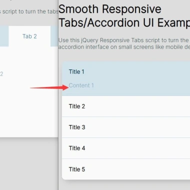
预览截图
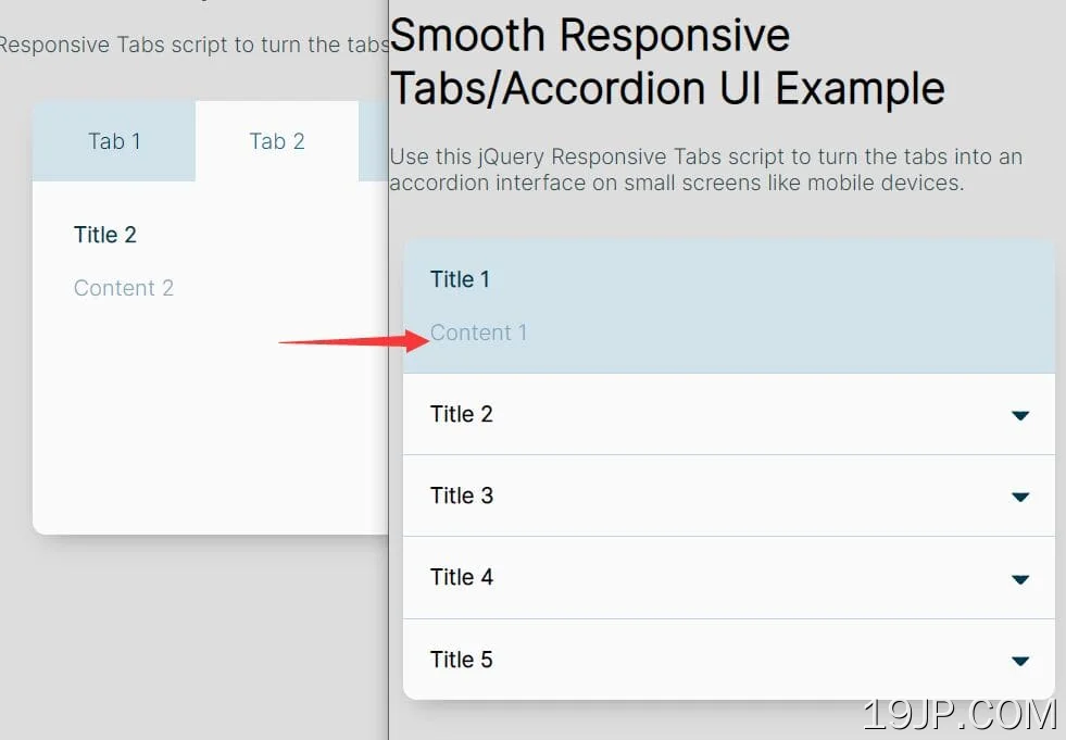 jQuery 平滑响应选项卡/Accodion UI