最新资源


简介
progresspieSVG是一个简单而强大的jQuery插件,它使用SVG公司元素
它被设计成进度条的替代品,因为它只描绘了一个值
此插件可用于绘制只有一个已填充饼图(其余为空)的饼图。Â
它被设计成进度条的替代品,因为它只是描述一个值(以百分比为单位)。
插件假设以百分比表示的值是文档的一部分(可见或作为属性值),并且将动态插入表示每个值的小饼图。
这可以是静态显示,也可以在数据改变时更新饼图。
特征:
- 大量定制选项。
- 旋转动画。
- 动态自动更新。
典型应用:
默认情况下,此模式假设一个值(包括0和100之间的整数,支持浮点数,但被截断)是HTML元素(例如span元素)的唯一文本内容,并且饼图将被前置(或附加)到同一元素。饼图通常会自动调整大小以适应文本行。可以配置要放置在饼图和数字之间的分隔符字符串。默认情况是在饼图前面加上一个不间断的空格作为分隔符。例如,假设您有如下HTML代码<p>您获得了50分中的25分(<span class=“pie”>50</span>%)</p>,然后你可以插入一个50%的馅饼$(.pie).progressPie();,导致类似于以下的线条:<p>您获得了25分(满分50分)(<span class=“pie”><svg>饼图</svg>50分</span>%)</p>.
基本用法:
选择包含百分比数字的元素,并通过jQuery选择器将饼图插入其中。在jQuery结果集上调用“progressPie(options)”,其中options是一个带有配置选项的可选对象。该插件应用于结果集中的任何元素,即,如果选择器没有找到任何匹配的元素,则不会发生任何事情,而如果选择器找到了几个匹配元素,则插件将尝试将相应的饼图分别插入到每个找到的元素中。
1.在您的项目中加载最新版本的jQuery库和jQuery progresspieSVG插件。
<script src="//code.jquery.com/jquery-2.1.4.min.js"></script>
<script src="js/min/jquery-progresspiesvg-min.js"></script>
2. The HTML.
<span class="demo">100</span> %
3.呈现默认饼图样式的进度条。
$(".demo").progressPie();
配置选项:
1.选项和默认值
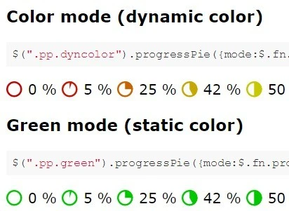
// $.fn.progressPie.Mode.GREY
// $.fn.progressPie.Mode.RED
// $.fn.progressPie.Mode.GREEN
// $.fn.progressPie.Mode.COLOR
mode: $.fn.progressPie.Mode.GREY,
// The stroke with of the outer circle
strokeWidth: 2,
// If undefined, the plug-in will try to draw the pie in the actual height of the parent element.
// Beware: If the element is empty, the browser may have calculated a height of 0! In this case, a default size will be used. Defining this option disables auto-sizing: the provided number will be used as height and width of the svg.
// It has to be a number (in pixels), not a string with a unit!
// This is typically used on empty elements in combination with valueData, valueAttr or valueSelector.
size: null,
// Name of a value attribute: If defined, the function will look for an attribute of this name inside the opening tag of the found element, and if found, it will parse this attribute's value instead of the element's content as the percent value.
// (If defined but not of type "string", the function will throw an exception.) For accessing data-* attributes, the next option valueData is usually preferred, use valueAttr only if you want to read other attributes (not beginning with data-) or if you really want to react to updates to the attribute in the DOM tree.
valueAttr: null,
// Mutually exclusive with valueAttr and valueSelector! Name of a jQuery data object.
valueData: null,
// Mutually exclusive with valueAttr and valueData!
// If defined, the function will apply a jQuery search within the selected element to find a sub-element whose text content is to be used as a value.
// Usually, the whole text content of the node previously selected (to which the progresspie-plugin is applied) is interpreted as the value.
// If you want to have more content, maybe for CSS styling reasons, and the actual value is in a sub-element, but the pie should not be inserted into that sub-element but into the previously selected main element, then this option is for you.
valueSelector: null,
// If undefined, the color of the pie depends on the mode option, see above.
// A valid string value of this option would be a color name like navy or color code like #888, #FF00BC, rgb(10,20,255).
// If the value is a function, this function has to read one parameter of type number (0..100) and return a color code (string).
// If the option is neiter undefined nor a string nor a function, the plugin will throw an exception.
color: null,
// Only evaluated if color is undefined.
// Name of a color attribute: If defined, the function will look for an attribute of this name inside the opening tag of the found element, and if found, will try to use the attribute's content (string) to set the pie color.
// The attribute must contain a color name or code (see color).
colorAttr: null,
// Only evaluated if no color has already been set with color or colorAttr.
// Name of an attribute containing JavaScript code (as string literal) for calculating a color.
colorFunctionAttr: null,
// This object may contain a subset of the option properties described above {mode, color, valueAttr, valueAdapter, colorAttr, colorFunctionAttr, size, ringWidth}.
// If inner is not undefined, then two piecharts will be drawn: An outer, larger chart with circle around it, described with all the other options, and a second, smaller, inner pie on top of the outer.
// The inner circle's value might be taken from a second attribute (denoted by inner.valueAttr) or might be calculated from the same value string as the outer value, just by a different inner.valueAdapter mapping.
// At least one of these two options should be defined.
// Also, the inner pie should have a different color than the outer one, defined by inner.mode or inner.color.
// If inner.size is specified, the outer size option should also be set manually and should be larger than innser.size.
// If inner.size is left undefined, the inner pie is automatically slightly smaller than the outer one (approx. two thirds of the outer).
inner: null,
// If this option is âtruthyâ (i.e. not undefined, not false, not 0 etc.), the (outer) pie or ring fragment will be animated by rotating around its center.
rotation: null,
// If true, the pie will be inserted at the beginning of the element's content, followed by the separator string.
// If false, the separator string followed by the pie will be appended to the element's content.
prepend: true,
// Will separate the inserted pie from the rest of the content
separator: " ",
// Defines the CSS-property vertical-align of the inserted SVG element and thus the vertical alignment.
verticalAlign: "bottom",
// If false, the function will do nothing if the target element already contains an svg element.
// Set to true if repeated calls are meant to update the graphic.
update: false,
// Executed when interpreting the value
valueAdapter: function(value) {
if (typeof value === "string") {
return parseInt(value);
} else if (typeof value === "number") {
return value;
} else {
return 0;
}
},
// If undefined, a portion of the pie will be filled, cut out just to the center of the circle (like a partial sweep of a radar).
// If ringWidth is a number, only the outer rim of this piece of the pie is drawn, leaving an empty circle in the middle with diameter
ringWidth: null,
// Only applicable if ringWidth is defined, ignored in pie mode.
// If a ring is drawn, both ends of the ring are normally cut rectangularly.
// Enabling this option draws a semicircle cap on each end. This might look prettier especially for very large
ringEndsRounded: false
2.可能的值模式选项
/** Default Mode: Pie is drawn in a shade of grey. The HTML color code is "#888" and may be changed by
 * overwriting <code>jQuery.fn.progressPie.Mode.GREY.color</code> (of type string).
 * @type {Object}
 */
GREY:{color:"#888"},

/** In mode RED the pie is drawn in red color regardless of the percentual value.
 * <code>jQuery.fn.progressPie.Mode.RED.value</code> is a variable of type "number" with the default value
 * of 200 and means the red color will be <code>rgb(200, 0, 0)</code>.
 * The variable RED.value is not only used in mode RED, but also in mode COLOR for calculating the
 * color of any value between 0 and 50.
 * @type {Object}
 */
RED:{value:200},

/** In mode GREEN the pie is drawn in green color regardless of the percentual value.
 * <code>jQuery.fn.progressPie.Mode.GREEN.value</code> is a variable of type "number" with the default value
 * of 200 and means the green color will be <code>rgb(0, 200, 0)</code>.
 * The variable GREEN.value is not only used in mode GREE, but also in mode COLOR for calculating the
 * color of any value between 50 and 100.
 * @type {Object}
 */
GREEN:{value:200},

/** In mode COLOR the color of the pie is depending on the percentual value.
 * The color is calculated via {@link "$.fn.progressPie".colorByPercent}.
 * It's the same green color as in mode GREEN for a value of 100 percent, the same red color
 * as in mode RED for a value of 0%.
 * The colors may be altered by overwriting progressPie.Mode.RED.value or progressPie.Mode.GREEN.value.
 */
COLOR:{}
更新日志:
2023-03-10
- v2.6.3:固定CSS关键帧注入f.旋转动画
2018-10-25
- v2.6.2:修复:CSS模式下的CheckComplete插件
2018-10-04
- v2.6.1版本
2018-10-02
- v2.6.0版本
2018-04-16
- v2.5.0版本
2017-07-10
- v2.3.0版本
2017-05-17
- 向setupProgressPie()添加了替换参数
2016-09-19
- v2.0:修复:SVG的宽度/高度现在为int
2016-04-24
- v1.5.0版本
2015-09-14
- 添加的strokeColor选项
预览截图
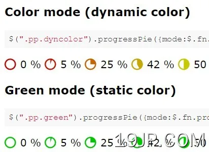 jQuery和SVG 动态饼图样式进度条 progresspieSVG