最新资源


简介
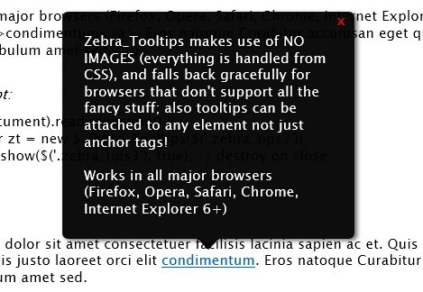
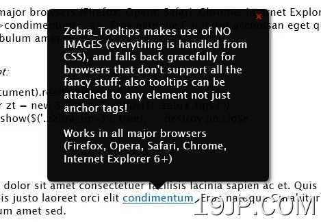
Zebra_Tooltips是一个轻量级、高度可定制和跨浏览器的jQuery插件,用于创建简单但智能且具有视觉吸引力的工具提示,具有良好的转换功能,并提供许多配置选项
可以通过JavaScript和/或CSS轻松定制外观。此外,工具提示可以相对于父元素向左、居中或向右对齐
Zebra_Tooltips利用了NOIMAGES(一切都由CSS处理),对于不支持所有花哨内容的浏览器,它会优雅地后退;工具提示也可以附加到任何元素,而不仅仅是锚点标记!
基本用法:
1.在页面上包含所需的CSS文件
<link rel="stylesheet" href="css/zebra_tooltips.css" type="text/css">
2.在你的网页上包括jQuery库和Zebra_Toltips插件
<script type="text/javascript" src="jquery.min.js"></script>
<script type="text/javascript" src="zebra_tooltips.js"></script>
3. The Html
a href="#" class="demo" title="One of the BEST jQuery websites that provide web designers and developers with a simple way to preview and download a variety of Free jQuery Plugins.">jQueryScript.Net</a>
4.在文档上调用插件。
$(document).ready(function() {

  new $.Zebra_Tooltips($('.demo'));

});
5.具有默认值的所有可用选项。
//  The speed (in milliseconds) of the animation used to show/hide tooltips.
animation_speed: 250,

//  The number of pixels the tooltips should use to "slide" into position.
//  Set to 0 for no sliding.
animation_offset: 20,

//  By default, if the users clicks when over a tooltip, the tooltip will
//  close (if the tooltip was not open using the API, that is)
//  Set this property to FALSE to prevent this behavior.
close_on_click: true,

//  The content of the tooltip.
//  By default, the content of the tooltip is taken from the "title"
//  attribute of the element the tooltip is attached to and has priority
//  over this property (meaning that if the "title" attribute is set,
//  the value of this property is ignored).
//  Use this property to set the content of the tooltip when you can't
//  or don't want to use the "title" attribute.
content: false,

//  The delay (in milliseconds) after which to hide the tooltip once the
//  mouse moves away from the trigger element or the tooltip.
hide_delay: 100,

//  Should tooltips remain visible also when the mouse cursor is over
//  the tooltips or should the tooltips be visible strictly when the mouse
//  cursor is over the parent elements.
keep_visible: true,

//  Maximum width of the tooltip's content;
max_width: 250,

//  The tooltip's opacity.
//  Must be a value between 0 (completely transparent) and 1 (completely
//  opaque)
opacity: '.95',


//  The tooltip's position, relative to the trigger element.
//  Can be 'center', 'left' or 'right'.
position: 'center',

//  If set to TRUE, tooltips will be created on document load, rather than
//  only when needed.
prerender: false,

//  The delay (in milliseconds) after which to show the tooltip once the
//  mouse is over the trigger element.
show_delay: 100,

//  By default, tooltips are shown above the elements they are attached to
//  and are shown below only if there isn't enough space above.
//  Set the value of this property to "below" if you want to reverse the
//  default behavior so that tooltips will be shown below the elements
//  they are attached to and will be shown above only there isn't enough
//  space below.
//  Possible values are "above" and "below".
vertical_alignment: 'above',

//  How close (in pixels) should the tip of the tooltip be relative to
//  the parent element.
vertical_offset: 0
6.回调函数。
//  Event fired before a tooltip is hidden.
//
//  The callback function receives as arguments the element the
//  tooltip is attached to, and the tooltip element.
//
//  If the callback function returns boolean FALSE, the tooltip will
//  not be hidden.
onBeforeHide: null,

//  Event fired after a tooltip is hidden.
//
//  The callback function receives as arguments the element the
//  tooltip is attached to, and the tooltip element.
onHide: null,

//  Event fired before a tooltip is shown.
//
//  The callback function receives as arguments the element the
//  tooltip is attached to, and the tooltip element.
//
//  If the callback function returns boolean FALSE, the tooltip will
//  not be shown.
onBeforeShow: null,

//  Event fired after a tooltip is shown.
//
//  The callback function receives as arguments the element the
//  tooltip is attached to, and the tooltip element.
onShow: null
7.API方法。
var myTooltip = new $.Zebra_Tooltips($('.demo'));

// shows the tooltip
myTooltip.show(element, [destroy = FALSE])

// hides the tooltip
hide(element, [destroy = FALSE])
更新日志:
v2.3.0版本(2023-01-22)
- 修复了一个长期存在的问题,即包装会在没有明显原因的情况下发生,主要发生在带有短消息的工具提示中
v2.2.0 (2021-10-06)
- 将焦点事件绑定到父元素,以便在使用TAB键时打开和关闭工具提示,使工具提示更易于访问;Â
- 增加了对noConflict模式下jQuery的支持;
v2.2.0 (2021-10-06)
- 将焦点事件绑定到父元素,以便在使用TAB键时打开和关闭工具提示,使工具提示更易于访问;Â
- 增加了对noConflict模式下jQuery的支持;
v2.1.1版本(2020-07-20)
- 已将SASS文件添加到dist文件夹
v2.1.0版本(2020-03-16)
- 已修复Bug
v2.0.5版本(2018-10-14)
- 使用Clean CSS缩小CSS大小
- 修复了多个工具提示都使用相同内容的错误
- 修复了一个问题,即自上次提交以来,传递给构造函数的选项不再被应用;谢谢Gianluca Finocchiaro!
v2.0.2版本(2018-07-09)
- 添加了版本号作为公共属性-即使您只有缩小的源代码,也有助于查找版本号
- 现在还可以通过数据属性设置属性
v2.0.1版本(2018-07-09)
- 性能调整
v2.0.0版本(2018-07-08)
- 删除了背景色和颜色属性
- 使用×;用于关闭按钮而不是x
- 已将特性default_position重命名为vertical_lignalign
- 如果附加到onBeforeShow和onBeforeHide事件的回调函数返回布尔值FALSE,则相应的操作将被取消
- 工具提示的样式已经更新,并添加了3个主题
v1.3.1 (2017-12-18)
- 将CSS移植到SASS
- 小的源代码调整
- 明确说明RGBA值可用于背景颜色
- 一些样式更新
- 不再设置字体大小
- 错误修复
v1.2.4 (2017-05-17)
- 小的源代码调整
v1.2.3(2016年1月17日)
- 增加了“严格使用”
v1.2.2 (2015-01-16)
- “title”属性不再被删除
- 在示例中将jQuery更新为1.12.0
- 增加了Grunt集成,用于自动化JSHint和Uglify流程
- 增加了与Bower的集成
v1.2.1 (2013-11-26)
- 添加了新的“default_position”属性
v1.2.0(2013年10月19日)
- 更新的文件和参考资料
预览截图
 轻量级和高度可定制 jQuery工具提示插件 Zebra_Toltips