最新资源


简介
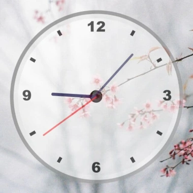
一款简单、时尚、响应灵敏的模拟时钟,使用CSS3 2D变换旋转指针。
参见:
- 10个最好的模拟时钟JavaScript
如何使用它:
1.为模拟时钟创建HTML。
<div id="clockContainer">
  <div id="hour"></div>
  <div id="minute"></div>
  <div id="second"></div>
</div>
2.在CSS中设置指针和钟面的样式。
#clockContainer {
  top: 3vw;
  position: relative;
  width: 40vw;
  height: 40vw;
  background: url(clock.png) no-repeat;
  background-size: 100%;
  margin: auto;
  opacity: 0.8;
}

#hour, #minute, #second {
  position: absolute;
  background-color: black;
  border-radius: 10px;
  transform-origin: bottom;
}

#hour {
  height: 26%;
  width: 1.8%;
  top: 24%;
  left: 48.9%;
  opacity: 1;
  background-color: rgb(7, 1, 61);
}

#minute {
  height: 32%;
  width: 1.2%;
  top: 17%;
  left: 49%;
  opacity: 0.7;
  background-color: rgb(7, 1, 61);
}

#second {
  background-color: red;
  height: 38%;
  width: 0.8%;
  top: 12%;
  left: 49.4%;
  opacity: 0.7;
}
3.在文档中加载最新的jQuery库(建议使用瘦版本)。
<script src="/path/to/cdn/jquery.slim.min.js"></script>
4.激活模拟时钟。
setInterval(() => {
  date= new Date();
  h=date.getHours();
  m=date.getMinutes();
  s=date.getSeconds();
  console.log(h+":"+m+":"+s);

  hrotation= 30*h + m/2;
  mrotation= 6*m;
  srotation= 6*s;
  console.log(hrotation+":"+mrotation+":"+srotation);

  $("#hour").css("transform", `rotate(${hrotation}deg)`);
  $("#minute").css("transform", `rotate(${mrotation}deg)`);
  $("#second").css("transform", `rotate(${srotation}deg)`);

}, 1000);
预览截图
 jQuery和CSS3 最小清洁模拟时钟