最新资源


简介
Tempus Dominus Bootstrap 4插件的书面版本。
Tempus Dominus是一款功能强大、完全可定制、轻量级的Vanilla JavaScript和jQuery日期/时间选择器。它是对本地HTML5日期和时间输入类型的零依赖性替换
特征:
- 多种语言。
- 自动语言检测。
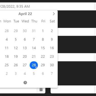
- 5种视图模式:“时钟”|“日历”|“月”|“年”|“几十年”。
- 允许启用/禁用日期。
- 允许选择日期范围。
- 允许禁用/启用日期和时间。
- 允许禁用一周中的几天。
- 允许选择多个日期。
- 智能定位(需要popperjs库)。
- 删除了jQuery和Moment.js的依赖项。
目录:
- 初始化
- 选项
- 方法
- 事件
如何使用它:
1.要开始,请在文档中加载所需的popperjs库、Font Awesome 5和Tempus Dominus文件。
<link rel="stylesheet" href="/path/to/dist/css/tempus-dominus.css" />
<link rel="stylesheet" href="/path/to/[email protected]/all.min.css" />
<script src="/path/to/[email protected]/popper.min.js"></script>
<script src="/path/to/dist/js/tempus-dominus.js"></script>
2.您仍然可以将其用作jQuery插件。
<script src="/path/to/jquery.min.js"></script>
<script src="/path/to/dist/js/jQuery-provider.min.js"></script>
3.将日期选择器附加到输入字段。
<input id="example" type="text" />
// Vanilla JS
new tempusDominus.TempusDominus(document.getElementById('example'), {
    // options here
});

// jQuery
$('#example').tempusDominus({
  // options here
});
4.启用触发按钮以切换日期选择器。
<div
  class="input-group"
  id="example"
  data-td-target-input="nearest"
  data-td-target-toggle="nearest"
>
  <input
    id="exampleInput"
    type="text"
    data-td-target="#example"
  />
  <span
    class="input-group-text"
    data-td-target="#example"
    data-td-toggle="datetimepicker"
  >
    <span class="fas fa-calendar"></span>
 </span>
</div>
// Vanilla JS
new tempusDominus.TempusDominus(document.getElementById('example'), {
    // options here
});

// jQuery
$('#example').tempusDominus({
  // options here
});
5.您还可以将日期选择器附加到文档中的任何元素。
<span
  id="example"
>
  <i class="fa-solid fa-calendar"></i>
</span>
// Vanilla JS
new tempusDominus.TempusDominus(document.getElementById('example'), {
    // options here
});

// jQuery
$('#example').tempusDominus({
  // options here
});
6.设置日期选择器的语言。当地可用:
- de
- en
- es
- it
- nl
- ro
- ru
new tempusDominus.TempusDominus(document.getElementById('example'), {
    localization: {
      dayViewHeaderFormat: { month: 'long', year: '2-digit' },
      locale: 'es',
      startOfTheWeek: 0
    },
});
7.组合两个日期选择器以创建一个日期范围选择器。
<!-- Date Picker 1 -->
<label for="linkedPickers1Input" class="form-label">From</label>
<div
class="input-group log-event"
id="linkedPickers1"
data-td-target-input="nearest"
data-td-target-toggle="nearest"
>
  <input
    id="linkedPickers1Input"
    type="text"
    class="form-control"
    data-td-target="#linkedPickers1"
  />
  <span
    class="input-group-text"
    data-td-target="#linkedPickers1"
    data-td-toggle="datetimepicker"
  >
    <span class="fa-solid fa-calendar"></span>
   </span>
</div>

<!-- Date Picker 2 -->
<label for="linkedPickers2Input" class="form-label">To</label>
<div
  class="input-group log-event"
  id="linkedPickers2"
  data-td-target-input="nearest"
  data-td-target-toggle="nearest"
>
  <input
    id="linkedPickers2Input"
    type="text"
    class="form-control"
    data-td-target="#linkedPickers2"
  />
  <span
    class="input-group-text"
    data-td-target="#linkedPickers2"
    data-td-toggle="datetimepicker"
  >
    <span class="fa-solid fa-calendar"></span>
  </span>
</div>
const linkedPicker1Element = document.getElementById('linkedPickers1');
const linked1 = new tempusDominus.TempusDominus(linkedPicker1Element);
const linked2 = new tempusDominus.TempusDominus(document.getElementById('linkedPickers2'), {
      useCurrent: false
});
// using event listeners
linkedPicker1Element.addEventListener(tempusDominus.Namespace.events.change, (e) => {
  linked2.updateOptions({
    restrictions: {
      minDate: e.detail.date
    }
  });
});
// using subscribe method
const subscription = linked2.subscribe(tempusDominus.Namespace.events.change, (e) => {
  linked1.updateOptions({
    restrictions: {
      maxDate: e.date
    }
  });
});
8.所有默认选项:
const linkedPicker1Element = document.getElementById('linkedPickers1');
new tempusDominus.TempusDominus(document.getElementById('example'), {

    // enable/disable dates & times
    restrictions: {
      minDate: undefined,
      maxDate: undefined,
      disabledDates: [],
      enabledDates: [],
      daysOfWeekDisabled: [],
      disabledTimeIntervals: [],
      disabledHours: [],
      enabledHours: []
    },

    // display options
    display: {
      icons: {
        // "icons" or "sprites"
        type: 'icons',
        time: 'fa-solid fa-clock',
        date: 'fa-solid fa-calendar',
        up: 'fa-solid fa-arrow-up',
        down: 'fa-solid fa-arrow-down',
        previous: 'fa-solid fa-chevron-left',
        next: 'fa-solid fa-chevron-right',
        today: 'fa-solid fa-calendar-check',
        clear: 'fa-solid fa-trash',
        close: 'fa-solid fa-xmark'
      },
      // display the date and time pickers side by side
      sideBySide: false,
      // display an additional column with the calendar week for that week
      calendarWeeks: false,
      // 'clock' | 'calendar' | 'months' | 'years' | 'decades'
      viewMode: 'calendar',
      // 'top' | 'bottom'
      toolbarPlacement: 'bottom',
      keepOpen: false,
      // enable/disable buttons
      buttons: {
        today: false,
        clear: false,
        close: false
      },
      // enable/disable components
      components: {
        calendar: true,
        date: true,
        month: true,
        year: true,
        decades: true,
        clock: true,
        hours: true,
        minutes: true,
        seconds: false,
        useTwentyfourHour: false
      },
      // inline mode
      inline: false
    },

    // control how much the minutes are changed by
    stepping: 1,

    // use the current date/time
    useCurrent: true,

    defaultDate: undefined,

    localization: {
      today: 'Go to today',
      clear: 'Clear selection',
      close: 'Close the picker',
      selectMonth: 'Select Month',
      previousMonth: 'Previous Month',
      nextMonth: 'Next Month',
      selectYear: 'Select Year',
      previousYear: 'Previous Year',
      nextYear: 'Next Year',
      selectDecade: 'Select Decade',
      previousDecade: 'Previous Decade',
      nextDecade: 'Next Decade',
      previousCentury: 'Previous Century',
      nextCentury: 'Next Century',
      pickHour: 'Pick Hour',
      incrementHour: 'Increment Hour',
      decrementHour: 'Decrement Hour',
      pickMinute: 'Pick Minute',
      incrementMinute: 'Increment Minute',
      decrementMinute: 'Decrement Minute',
      pickSecond: 'Pick Second',
      incrementSecond: 'Increment Second',
      decrementSecond: 'Decrement Second',
      toggleMeridiem: 'Toggle Meridiem',
      selectTime: 'Select Time',
      selectDate: 'Select Date',
      dayViewHeaderFormat: { month: 'long', year: '2-digit' },
      locale: 'default',
      // 0 = Sunday, 6 = Saturday
      startOfTheWeek: 0
    },

    keepInvalid: false,

    debug: false,

    // show the date picker on focus
    allowInputToggle: false,

    viewDate: new DateTime(),

    multipleDates: false,

    multipleDatesSeparator: '; ',

    promptTimeOnDateChange: false,

    promptTimeOnDateChangeTransitionDelay: 200,

    // provide developers a place to store extra information about the picker
    meta: {},

    // change the target container
    container: undefined,

    // enable date range selection
    dateRange: false,

    // custom separator for multiple dates
    multipleDatesSeparator: '; ',

    // placemenet
    placement: 'bottom',

});
9.API方法:
const myPicker = new tempusDominus.TempusDominus(document.getElementById('example'), {
      // ...
});

// return the current date
myPicker.viewDate

// return a DateTime object
myPicker.dates

// return the picked date
myPicker.dates.picked

// return the last picked date
myPicker.dates.lastPicked

// return the last picked index
myPicker.dates.lastPickedIndex

// add a DateTime
myPicker.dates.add(DateTime);

// set the date index
myPicker.dates.setValue(value: DateTime, index?: number);

// convert a DateTime object to a string
myPicker.dates.formatInput(value: DateTime);

// convert a string into a DateTime object
myPicker.dates.setFromInput(value: any, index?: number);

// return true if the target date is part of the selected dates array
myPicker.dates.isPicked(DateTime, Unit?);

// return the index at which target date is in the array
myPicker.dates.pickedIndex(DateTime, Unit?);

// clear all picked dates
myPicker.dates.clear();
// OR
myPicker.clear();

// toggle the date picker
myPicker.toggle();

// show the date picker
myPicker.show();

// hide the date picker
myPicker.hide();

// add/remove CSS classes
myPicker.paint(Unit | 'decade', DateTime, string[], HTMLElement);

// enable the date input
myPicker.enable();

// disable the date input
myPicker.disable();

// toggle the date input
myPicker.enable();

// destroy the date picker
myPicker.dispose();

// update options
myPicker.updateOptions(object, boolean?);
10.事件:
const myPicker = new tempusDominus.TempusDominus(document.getElementById('example'), {
      // ...
});

const subscription = picker.subscribe(tempusdominus.Namespace.events.change, (e) => {
      // on change
});

const subscription = picker.subscribe(tempusdominus.Namespace.events.show, (e) => {
      // on show
});

const subscription = picker.subscribe(tempusdominus.Namespace.events.hide, (e) => {
      // on hide
});

const subscription = picker.subscribe(tempusdominus.Namespace.events.update, (e) => {
      // on update
});

const subscription = picker.subscribe(tempusdominus.Namespace.events.error, (e) => {
      // on error
});
更新日志:
版本6.7.7(2023-04-23)
- 放置选项
- 导出默认的美国语言环境
- 当userCurrent为false时,时钟现在将显示——而不是
- 错误修复程序
版本6.4.4(2023-03-22)
- 错误修复
版本6.4.3(2023-03-17)
- 修复了日期格式的问题
- 固定格式转义括号
版本6.4.1(2023-03-15)
- 将自定义日期格式迁移到主代码
- 添加了日期范围功能
- 固定多个日期时添加的前导分隔符
版本6.2.10(2022-12-24)
- 错误修复
版本6.2.9(2022-12-16)
- 错误修复
版本6.2.8(2022-12-15)
- 预提交挂钩。Linter和Beatler现在在每次提交之前都会运行。
- 本地语言和插件现在都包含了打字员。
- 错误修复。
版本6.2.7(2022-11-05)
- 错误修复程序
版本6.2.6(2022-10-29)
- 修复了禁用/启用日期的性能问题。这也应该修复下个月/上个月的选择
- 修复了跨选项同步的视图日期和未正确更新的问题
版本6.2.5(2022-10-25)
- 增加了波兰本地化
- 已更新区域设置以包含格式
- 导出(重新导出?)选项界面
版本6.2.4(2022-09-29)
- 错误修复程序
版本6.2.3(2022-09-28)
- 固定popper参考
版本6.1.2(2022-09-23)
- 现在可以通过
版本6.0.1(2022-08-31)
- 大量改进和错误修复
版本6.0.0(2022-08-16)
- 大量改进和错误修复
Â
预览截图
 强大 多语言日期/时间选择器 Tempus Dominus