最新资源


简介
SmartTab是一个强大且高度可定制的jQuery插件,用于创建具有酷炫动画效果的选项卡式界面。
它支持ajax内容、键盘导航、Bootstrap 5、第三方CSS动画库,并与所有主要浏览器兼容。
如何使用它:
1.在网页上包含jQuery库和SmartTab.js脚本。
<script src="/path/to/cdn/jquery.min.js"></script>
<script src="/path/to/dist/js/jquery.smartTab.js"></script>
2.在网页上包含所需的样式表。所有可能的主题:
- 违约
- 阻碍
- 砖
- 精英
- 锻造
- 药丸
<!-- All in one -->
<link href="/path/to/dist/css/smart_tab_all.min.css" rel="stylesheet" />

<!-- Default Theme -->
<link href="/path/to/dist/css/smart_tab.min.css" rel="stylesheet" />

<!-- Blocks Theme -->
<link href="/path/to/dist/css/smart_tab_blocks.min.css" rel="stylesheet" />

<!-- Brick Theme -->
<link href="/path/to/dist/css/smart_tab_brick.min.css" rel="stylesheet" />

<!-- Elite Theme -->
<link href="/path/to/dist/css/smart_tab_elite.min.css" rel="stylesheet" />

<!-- Forge Theme -->
<link href="/path/to/dist/css/smart_tab_forge.min.css" rel="stylesheet" />

<!-- Bootstrap Pills Theme -->
<link href="/path/to/dist/css/smart_tab_pills.min.css" rel="stylesheet" />
3.选项卡式界面所需的标记结构。
<div id="smarttab">

  <!-- Tabs -->
  <ul class="nav">
    <li>
      <a class="nav-link" href="#tab-1">
        Tab 1
      </a>
    </li>
    <li>
      <a class="nav-link" href="#tab-2">
        Tab 2
      </a>
    </li>
    <li>
      <a class="nav-link" href="#tab-3">
        Tab 3
      </a>
    </li>
  </ul>

  <!-- Tabbed Content -->
  <div class="tab-content">
    <div id="tab-1" class="tab-pane" role="tabpanel">
      Tab content 1
    </div>
    <div id="tab-2" class="tab-pane" role="tabpanel">
      Tab content 2
    </div>
    <div id="tab-3" class="tab-pane" role="tabpanel">
      Tab content 3
    </div>
  </div>

</div>
4.调用吨容器上的插件并完成。
$('#smarttab').smartTab();5.使用以下选项自定义插件。
$('#smarttab').smartTab({

  // Selected Tab, 0 = first tab
  selected: 0,

  // theme name
  theme: 'default',

  // Justified layout for tabs
  justified: true,

  // Auto adjust content height
  autoAdjustHeight: true,

  // Supports for Back button
  backButtonSupport: true,

  // Enables URL hash
  enableURLhash: true,

  // Configs animations here
  transition: {

    // Animation effect on navigation
    // none|fade|slideHorizontal|slideVertical|slideSwing|css(Animation CSS class also need to specify)
    animation: 'none',

    // Animation speed.
    speed: '400',

    // Easing function.
    // Requires jQuery easing plugin
    easing: '',

    // Only used if animation is 'css'
    prefixCss: '',
    fwdShowCss: '',
    fwdHideCss: '',
    bckShowCss: '',
    bckHideCss: '',

  },

  // Auto switches between tabs
  autoProgress: {

    // enable
    enabled: false,

    // interval in ms
    interval: 3500,

    // stop on focus
    stopOnFocus: true

  },

  // Keyboard navigation
  keyboardSettings: {

    // enable
    keyNavigation: true,

    // keycodes
    keyLeft: [37, 38],
    keyRight: [39, 40],
    keyHome: [36],
    keyEnd: [35],

  },

  // CSS Class settings
  style: {
    mainCss: 'st',
    navCss: 'nav',
    navLinkCss: 'nav-link',
    contentCss: 'tab-content',
    contentPanelCss: 'tab-pane',
    themePrefixCss: 'st-theme-',
    justifiedCss: 'st-justified',
    anchorDefaultCss: 'default',
    anchorActiveCss: 'active',
    loaderCss: 'st-loading'
  },

  // Callback function for content loading
  getContent: null,

});
6.覆盖默认的CSS变量来创建自己的样式。
:root {
  --st-background: unset,
  --st-border: 1px solid #eeeeee,
  --st-anchor-default-primary-color: #f8f9fa;
  --st-anchor-default-secondary-color: #b0b0b1;
  --st-anchor-active-primary-color: #009EF7;
  --st-anchor-active-secondary-color: #ffffff;
  --st-anchor-disabled-primary-color: #f8f9fa;
  --st-anchor-disabled-secondary-color: #dbe0e5;
  --st-loader-color: #009EF7;
  --st-loader-background-color: #f8f9fa;
  --st-loader-background-wrapper-color: rgba(255, 255, 255, 0.7);
}
7.API方法。
// goto the next tab
$('#smarttab').smartTab("next");

// back to the previous tab
$('#smarttab').smartTab("prev");

// goto the first tab
$('#smarttab').smartTab("first");

// goto the last tab
$('#smarttab').smartTab("last");

// reset tabs
$('#smarttab').smartTab("reset");

// goto a specific tab
$('#smarttab').smartTab("goToTab", 3);

// update options
$('#smarttab').smartTab("setOptions", options);

// get options
$('#smarttab').smartTab("getOptions");

// get the tab info
$('#smarttab').smartTab("getInfo");

// show/hide the loading animation
$('#smarttab').smartTab("loader", "show");
$('#smarttab').smartTab("loader", "hide");

// adjust the content height of the current step
$('#smarttab').smartTab("fixHeight");
更多示例:
- 典型的
- 底部
- 倍数
- 竖的
更新日志:
版本4.0.2(2022-07-31)
- 已修复:快速导航导致页面选择不当
- 更改:代码改进
版本4.0.1(2022-07-11)
- 添加:支持jQuery Slim版本
- 添加:公共函数fixHeight
- 添加:公共函数getInfo以获取选项卡索引和tota选项卡
- 添加了:带有force参数的goToTab函数
- 添加:新主题
- 添加:颜色可以使用CSS变量动态更改。
- 添加:Bootstrap 5支持
- 添加:初始化事件
- 添加:将CSS类名移动到选项
- 添加:可以扩展过渡动画
- 添加:CSS动画支持过渡动画。支持Animate.css
- 更改:JavaScript和CSS代码被重写
- 更改:强制所有CSS主题
- 更改:使大多数选项可以通过setOptions功能更改
- 更改:用最少且有意义的名称重写选项名称和属性
- 更改:改进了过渡动画
- 已移除:黑暗模式已移除。添加了CSS变量支持来更改任何颜色。
- 删除:删除了方向选项,而是将st垂直CSS类添加到主元素中
2020-06-15
- v3.1.1:一些优化
2020-05-09
- v3.0.1:优化了init方法
2020-05-04
- v3.0全新选项卡。
- 更新的文档。
2015-02-02
- 使现代化
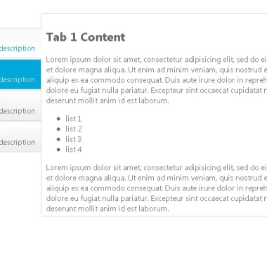
预览截图
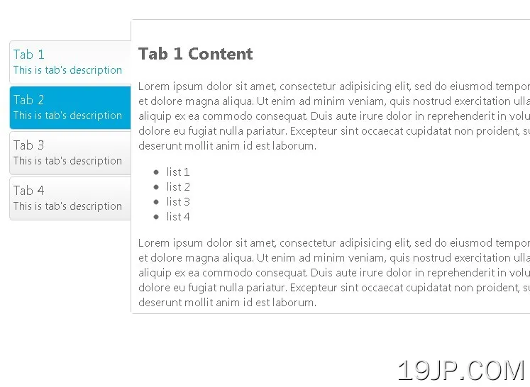 灵活 jQuery选项卡接口插件 SmartTab