最新资源


简介
PhotoSwipe是一个Vanilla JavaScript图像库,专为移动设备和触摸设备设计。
它为您的访问者提供了一个熟悉而直观的界面,使他们能够与您的移动网站上的图像进行交互。
安装和下载:
# NPM
$ npm install photoswipe --save
如何使用它:
1.在网页上包含PhotoSwipe的核心JavaScript和UI库。
<script src="/path/to/photoswipe.min.js"></script>
<script src="/path/to/photoswipe-ui-default.min.js"></script>
2.在网页上包含PhotoSwipe的核心样式表和您选择的主题CSS。
<link rel="stylesheet" href="/path/to/photoswipe.css">
<link rel="stylesheet" href="/path/to/default-skin/default-skin.css">
3.为照片擦除创建HTML模板。
<!-- Root element of PhotoSwipe. Must have class pswp. -->
<div class="pswp" tabindex="-1" role="dialog" aria-hidden="true">

  <!-- Background of PhotoSwipe.
       It's a separate element as animating opacity is faster than rgba(). -->
  <div class="pswp__bg"></div>

  <!-- Slides wrapper with overflow:hidden. -->
  <div class="pswp__scroll-wrap">

      <!-- Container that holds slides.
          PhotoSwipe keeps only 3 of them in the DOM to save memory.
          Don't modify these 3 pswp__item elements, data is added later on. -->
      <div class="pswp__container">
          <div class="pswp__item"></div>
          <div class="pswp__item"></div>
          <div class="pswp__item"></div>
      </div>

      <!-- Default (PhotoSwipeUI_Default) interface on top of sliding area. Can be changed. -->
      <div class="pswp__ui pswp__ui--hidden">

          <div class="pswp__top-bar">

              <!--  Controls are self-explanatory. Order can be changed. -->

              <div class="pswp__counter"></div>

              <button class="pswp__button pswp__button--close" title="Close (Esc)"></button>

              <button class="pswp__button pswp__button--share" title="Share"></button>

              <button class="pswp__button pswp__button--fs" title="Toggle fullscreen"></button>

              <button class="pswp__button pswp__button--zoom" title="Zoom in/out"></button>

              <!-- Preloader demo http://codepen.io/dimsemenov/pen/yyBWoR -->
              <!-- element will get class pswp__preloader--active when preloader is running -->
              <div class="pswp__preloader">
                  <div class="pswp__preloader__icn">
                    <div class="pswp__preloader__cut">
                      <div class="pswp__preloader__donut"></div>
                    </div>
                  </div>
              </div>
          </div>

          <div class="pswp__share-modal pswp__share-modal--hidden pswp__single-tap">
              <div class="pswp__share-tooltip"></div>
          </div>

          <button class="pswp__button pswp__button--arrow--left" title="Previous (arrow left)">
          </button>

          <button class="pswp__button pswp__button--arrow--right" title="Next (arrow right)">
          </button>

          <div class="pswp__caption">
              <div class="pswp__caption__center"></div>
          </div>

      </div>

  </div>

</div>
4.初始化PhotoSwipe。
var pswpElement = document.querySelectorAll('.pswp')[0];

// build items array
var items = [
    {
        src: 'https://placekitten.com/600/400',
        w: 600,
        h: 400
    },
    {
        src: 'https://placekitten.com/1200/900',
        w: 1200,
        h: 900
    }
];

// define options (if needed)
var options = {
    // optionName: 'option value'
    // for example:
    index: 0 // start at first slide
};

// Initializes and opens PhotoSwipe
var gallery = new PhotoSwipe( pswpElement, PhotoSwipeUI_Default, items, options);
gallery.init();
5.可用配置选项
{

  // allow swipe navigation to next/prev item
  allowPanToNext:true,

  // Spacing ratio between slides
  spacing: 0.12,

  // opacity of background
  bgOpacity: 1,

  // predefine if mouse was used or not
  mouseUsed: false,

  // infinite loop
  loop: true,

  // pinch to close
  pinchToClose: true,

  // close on scroll
  closeOnScroll: true,

  // close on vertical drag
  closeOnVerticalDrag: true,

  // vertical drag range
  verticalDragRange: 0.75,

  // duration of animation
  hideAnimationDuration: 333,
  showAnimationDuration: 333,

  // enable/disable show/hide opacity
  showHideOpacity: false,

  // auto set focus on element
  focus: true,

  // ESC to close
  escKey: true,

  // enable arrow keys
  arrowKeys: true,

  // main scroll end friction
  mainScrollEndFriction: 0.35,

  // pan end friction
  panEndFriction: 0.35,

  // function
  isClickableElement: function(el) {
    return el.tagName === 'A';
  },

  // function
  getDoubleTapZoom: function(isMouseClick, item) {
    if(isMouseClick) {
      return 1;
    } else {
      return item.initialZoomLevel < 0.7 ? 1 : 1.33;
    }
  },

  // max spread zoom
  maxSpreadZoom: 1.33,

  // modal mode
  modal: true

}
6.默认UI选项。
{

  // Size of top & bottom bars in pixels,
  // "bottom" parameter can be 'auto' (will calculate height of caption)
  // option applies only when mouse is used,
  // or width of screen is more than 1200px
  //
  // (Also refer to `parseVerticalMargin` event)
  barsSize: {top:44, bottom:'auto'},

  // Adds class pswp__ui--idle to pswp__ui element when mouse isn't moving for 4000ms
  timeToIdle: 4000,

  // Same as above, but this timer applies when mouse leaves the window
  timeToIdleOutside: 1000,

  // Delay until loading indicator is displayed
  loadingIndicatorDelay: 1000,

  // Function builds caption markup
  addCaptionHTMLFn: function(item, captionEl, isFake) {
    // item      - slide object
    // captionEl - caption DOM element
    // isFake    - true when content is added to fake caption container
    //             (used to get size of next or previous caption)

    if(!item.title) {
        captionEl.children[0].innerHTML = '';
        return false;
    }
    captionEl.children[0].innerHTML = item.title;
    return true;
  },

  // Buttons/elements
  closeEl:true,
  captionEl: true,
  fullscreenEl: true,
  zoomEl: true,
  shareEl: true,
  counterEl: true,
  arrowEl: true,
  preloaderEl: true,

  // Tap on sliding area should close gallery
  tapToClose: false,

  // Tap should toggle visibility of controls
  tapToToggleControls: true,

  // Mouse click on image should close the gallery,
  // only when image is smaller than size of the viewport
  clickToCloseNonZoomable: true,

  // Element classes click on which should close the PhotoSwipe.
  // In HTML markup, class should always start with "pswp__", e.g.: "pswp__item", "pswp__caption".
  //
  // "pswp__ui--over-close" class will be added to root element of UI when mouse is over one of these elements
  // By default it's used to highlight the close button.
  closeElClasses: ['item', 'caption', 'zoom-wrap', 'ui', 'top-bar'],

  // Separator for "1 of X" counter
  indexIndicatorSep: ' / ',


  // Share buttons
  //
  // Available variables for URL:
  // {{url}}             - url to current page
  // {{text}}            - title
  // {{image_url}}       - encoded image url
  // {{raw_image_url}}   - raw image url
  shareButtons: [
    {id:'facebook', label:'Share on Facebook', url:'https://www.facebook.com/sharer/sharer.php?u={{url}}'},
    {id:'twitter', label:'Tweet', url:'https://twitter.com/intent/tweet?text={{text}}&url={{url}}'},
    {id:'pinterest', label:'Pin it', url:'http://www.pinterest.com/pin/create/button/?url={{url}}&media={{image_url}}&description={{text}}'},
    {id:'download', label:'Download image', url:'{{raw_image_url}}', download:true}
  ],


  // Next 3 functions return data for share links
  //
  // functions are triggered after click on button that opens share modal,
  // which means that data should be about current (active) slide
  getImageURLForShare: function( shareButtonData ) {
    // `shareButtonData` - object from shareButtons array
    //
    // `pswp` is the gallery instance object,
    // you should define it by yourself
    //
    return pswp.currItem.src || '';
  },
  getPageURLForShare: function( shareButtonData ) {
    return window.location.href;
  },
  getTextForShare: function( shareButtonData ) {
    return pswp.currItem.title || '';
  },

  // Parse output of share links
  parseShareButtonOut: function(shareButtonData, shareButtonOut) {
    // `shareButtonData` - object from shareButtons array
    // `shareButtonOut` - raw string of share link element
    return shareButtonOut;
  }
}
更新日志:
v5.3.7版本(2023-03-29)
- 错误修复
v5.3.6版本(2023-02-27)
- 修复了导致延迟加载完整映像(来自src)而不是srcset的问题。此问题是由先前版本(5.3.5)引起的。
- 尽可能使用classList.toggle
v5.3.5版本(2023-02-01)
- 错误修复程序
v5.3.4(2022-11-22年)
- 在应用aria属性之前检查元素是否存在
v5.3.0版本(2022-10-25)
- 修复了错误。
v5.3.0版本(2022-07-23)
- 调整放大的类行为以反映切换的Zoom方法
v5.2.2 (2022-03-28)
- ES6中的代码质量和重写
- 更简单的初始化和动态导入支持
- 动画和手势引擎更新
- 单个CSS文件,无外部资产
- 内置响应图像支持
- 以缩放状态打开图像
- 从核心中删除了一些功能
- 文件更新(待定)
第4.1.3版(2019-01-09)
- 这个小补丁修复了输入端有多种类型、运行Windows 10和Chrome的设备的问题。
2017-04-07
- 修复iOS 10.3调整大小错误
2017-04-07
- 修复iOS 10.3调整大小错误
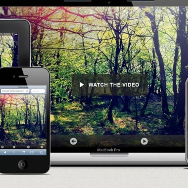
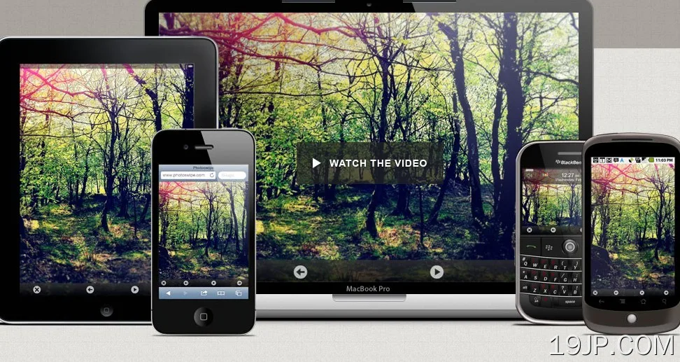
预览截图
 移动设备图片库 PhotoSwipe