最新资源


简介
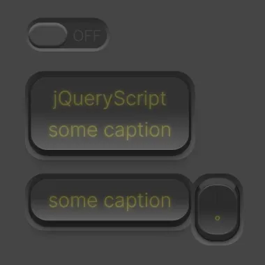
rsCheckboxSwitch是一个jQuery插件,可帮助开发人员在网页上创建逼真、动画化和键盘可访问的滑动/切换/推送开关
该插件支持一组不同的HTML标记,包括复选框、按钮和DIV元素。它还包括许多选项,用于自定义switch元素的外观、感觉和行为。
目录:
- 安装和安装
- 选项
- API方法
- 沉降器和沉降器
- 自定义样式
如何使用它:
1.在HTML文档中下载并加载rsCheckboxSwitch插件的文件。
<link rel="stylesheet" href="/path/to/rsCheckboxSwitch.css" />
<script src="/path/to/cdn/jquery.slim.min.js"></script>
<script src="/path/to/jquery.rsCheckboxSwitch.js"></script>
2.将一个元素转换为开关。
<!-- Checkbox -->
<input class="demo" type="checkbox" />

<!-- Div Button -->
<div class="demo">
  Press me
</div>

<!-- Button -->
<button class="demo">
  Press me
</button>
$('.demo').rsCheckboxSwitch({
  // ...
});
3.设置开关样式。默认值:“滑动”。滑动开关只显示一半(ON或OFF),而另一半隐藏。这意味着,开关必须比容器长才能夹住开关。拨动开关或按钮开关的尺寸总是相同的。切换开关不进行滑动,而是保持在相同的位置,并可以设置动画,从“打开”转换为“关闭”(反之亦然)。
- “滑动”
- '切换'
- “推动”
$('.demo').rsCheckboxSwitch({
  type: "push",
});
4.所有可能的自定义开关的插件选项。
$('.demo').rsCheckboxSwitch({

  // slidingType is only meaningful if type is 'sliding'
  slidingType: {

    // Classes for the outer container.
    // Add:
    // - corners-rounded for full rounded corners;
    // - corners-halfrounded for 50% rounded corners;
    // - corners-quarterrounded for 25% rounded corners;
    // - corners-sharp for no rounded corners;
    // If none of the above three are specified, corners-rounded is used.
    outerClass: 'checkboxswitch-outer sliding corners-rounded',

    // Classes for the element that slides inside the outer element.
    sliderClass: 'switch',

    // Classes for the handle usually located in the middle of the slider element.
    handleClass: 'handleflat',

    // Classes for the handle when mouse is applied to it. Type: string.
    pushdownClass: 'down',

    // Classes used during the time user is moving the switch with the mouse.
    draggingClass: 'switch-dragging',

    // Classes applied to the topmost element for vertical sliders (when horizontal is false).
    verticalClass: 'vert',

    // Classes applied to the topmost element when the slider is flipped
    flippedClass: 'flipped',

    // Determines the location of the on and off.
    // When flipped is false, the switch is ON--OFF (for horizontal switches) or ON on the top and OFF on the bottom (for vertical switches)
    // When flipped is true, the switch is OFF--ON (for horizontal switches) or OFF on the top and ON on the bottom (for vertical switches)
    flipped: false,

    // Determines the switch orientation, either horizontal or vertical.
    horizontal: true
  },

  // toggleType is only meaningful if type is 'toggle'
  toggleType: {

    // Classes for the container. Type: string.
    // Add:
    // - corners-rounded for full rounded corners;
    // - corners-halfrounded for 50% rounded corners;
    // - corners-quarterrounded for 25% rounded corners;
    // - corners-sharp for no rounded corners;
    // If none of the above four are specified, corners-rounded is used.
    outerClass: 'checkboxswitch-outer toggle corners-rounded',

    // Determines whether a span child is used to display 0 or 1 (you can change CSS to display something else).
    showOnOff: true,

    // Class added to the span created when showOnOff is true.
    onOffClass: 'onoff',

    // Specifies the text caption that appears in toggle switches.
    // If null, then uses the text from the markup.
    // If the plugin is not bounded to an <input type=checkbox> element, this caption is appended to the existing markup text (if any).
    // Type: String.
    caption: null,

    // Each class represents a frame in the animation that runs from OFF to ON position.
    // Type: array of String.
    // The first class is used for the OFF image, the last for the ON image.
    // Optional frames in the middle can be used to create a more realistic animation.
    // For ON to OFF animations, the plug-in simply iterates from the last to the first class.
    frameClasses: ['frm1', 'frm2', 'frm3', 'frm4', 'frm5']
  },

  // pushType is only meaningful if type is 'push'
  pushType: {

    // Classes for the container.
    // Add:
    // - corners-rounded for full rounded corners;
    // - corners-halfrounded for 50% rounded corners;
    // - corners-quarterrounded for 25% rounded corners;
    // - corners-sharp for no rounded corners;
    // If none of the above four are specified, corners-rounded is used.
    outerClass: 'checkboxswitch-outer toggle push corners-rounded',

    // Determines whether a span child is used to display 0 or 1 (you can change CSS to display something else).
    showOnOff: true,

    // Class added to the span created when showOnOff is true.
    onOffClass: 'onoff',

    // Specifies the text caption that appears in toggle switches.
    // If null, then uses the text from the markup.
    // If the plugin is not bounded to an <input type=checkbox> element, this caption is appended to the existing markup text (if any).
    caption: null,

    // Each class represents a frame in the animation that runs from OFF to ON position.
    // Type: array of String.
    // The first class is used for the OFF image, the last for the ON image. Optional frames in the middle can be used to create a more realistic animation.
    // For ON to OFF animations, the plug-in simply iterates from the last to the first class.
    frameClasses: ['frm1', 'frm2', 'frm3', 'frm4']
  },

  keyboard: {

    // Allowed keys on focusable switches.
    // Type: String array.
    // Key events are ignored for non focusable switches.
    // A switch is focusable when the associated markup is an <input type="checkox"> with no disabled attribute, or any HTML element with a tabindex attribute.
    allowed: ['enter', 'esc', 'space'],

    // Determines whether pressing Esc key rollsback to the value the switch had before gaining focus (the committed value).
    // Type: boolean or string.
    // Rolling back has no effect when the current value is the same as the committed value.
    //  true - Pressing Esc on a focusable switch rollsback value. Change events are not fired. Note that 'esc' should be present in the allowed property array (see above).
    // false - Ignores Esc keystrokes.
    // 'trueWithEvents' - Pressing Esc on a focusable switch rollsback value.
    //                    If it rolls back to On, then OnChange and OnChangeOn are fired.
    //                    If it rolls back to Off, then OnChange and OnChangeOff are fired.
    rollbackOnEsc: true,

    // Determines whether the value toggles on Enter or Space.
    //  true - Pressing Enter or Space changes value. Note that 'enter' or 'space' should be present in the allowed property array (see above).
    // false - Ignores Enter or Space keystrokes.
    toggleOnEnter: true,

    // Determines whether the value is saved when switch loses focus. Type: boolean.
    //  true - The current value is commited when switch loses focus.
    // false - Value is not commited.
    commitOnBlur: false
  },

  // Classes set to the outer div when the switch has been changed.
  changedClass: 'changed',

  // Classes set to the outer div when the switch is disabled.
  disabledClass: 'disabled',

  // Determines whether the control is editable.
  // If the plugin is associated with a disabled <input type="checkbox" disabled>, then enabled is set to false.
  enabled: true,

  // Handle animation in milliseconds. Type: positive integer number.
  // For Sliding switches, specifies the time it takes to move from one side to the other.
  // For Toggle or Push switches, specifies the time it takes to change from one position to another.
  speed: 75,

  // Event fired when switch changes to either On or Off.
  // Type: function (event, $elem, value)
  onChange: null,

  // Event fired when switch changes to On position.
  // Type: function (event, $elem)
  // If the markup is an <input type="checkbox"> then an attribute checked="checked" is added.
  // If other markup is used, then an attribute data-checked="checked" is added.
  onChangeOn: null,

  // Event fired when switch changes to OFF position.
  // Type: function (event, $elem)
  // If the markup is an <input type="checkbox"> then the attribute checked="checked" is removed.
  // If other markup is used, then the attribute data-checked="checked" is removed.
  onChangeOff: null

});
5.API方法。
// refresh$e.rsCheckboxSwitch('refresh')
$e.rsCheckboxSwitch('refresh', false)
$e.rsCheckboxSwitch('refresh', true)

// toggle
$e.rsCheckboxSwitch('toggle')

// set on/off states without animations
$e.rsCheckboxSwitch('on')
// OnChange and onChangeOn are never fired
$e.rsCheckboxSwitch('on', false)
OnChange and onChangeOn are always fired
$e.rsCheckboxSwitch('on', true)
$e.rsCheckboxSwitch('off')
$e.rsCheckboxSwitch('off', false)
$e.rsCheckboxSwitch('off', true)

// set on/off states with animations
$e.rsCheckboxSwitch('onAnim')
$e.rsCheckboxSwitch('onAnim', false)
$e.rsCheckboxSwitch('onAnim', true)
$e.rsCheckboxSwitch('offAnim')
$e.rsCheckboxSwitch('offAnim', false)
$e.rsCheckboxSwitch('offAnim', true)

// Rollsback the switch to the original value
$e.rsCheckboxSwitch('rollback')
// Change events are never fired
$e.rsCheckboxSwitch('rollback', false)
// Change events are always fired
$e.rsCheckboxSwitch('rollback', true)

// Notifies the plugin that current value is the "new" original one.
$e.rsCheckboxSwitch('commit')

// Unbinds all events and completely removes the plugin from the page.
$e.rsCheckboxSwitch('destroy')
6.沉降器和沉降器。
// Returns the current onChange event function handler
var onChangeFunction = $e.rsCheckboxSwitch('option', 'onChange');

// Returns the current onChangeOn event function handler
var onChangeOnFunction = $e.rsCheckboxSwitch('option', 'onChangeOn');

// Returns the current onChangeOff event function handler
var onChangeOffFunction = $e.rsCheckboxSwitch('option', 'onChangeOff');

// Returns true if switched was changed, false otherwise.
// "Changed" means the current value is different from the current commited value.
var changed = $e.rsCheckboxSwitch('option', 'changed');

// Returns switch current value.
var isOn = $e.rsCheckboxSwitch('option', 'value');

// Retuns true if switch can be changed by the user, false otherwise.
var isEnabled = $e.rsCheckboxSwitch('option', 'enabled');

// Sets the onChange event function handler
$e.rsCheckboxSwitch('option', 'onChange', function (event, $elem, value) { alert('value changed to ' + value); } );

// Sets the onChangeOn event function handler
$e.rsCheckboxSwitch('option', 'onChangeOn', function (event, $elem) { alert('value changed to true'); } )

// Sets the onChangeOff event function handler
$e.rsCheckboxSwitch('option', 'onChangeOff', function (event, $elem) { alert('value changed to false'); } )

// Enables or disables the switch control.
$e.rsCheckboxSwitch('option', 'enabled', true);
$e.rsCheckboxSwitch('option', 'enabled', false);
7.覆盖Less中的默认变量。
// recommended #454545 for dark layout and #f2f2f2 for light layout
@background: #454545;

// recommended 12% for dark layout and 18% for light layout
@deltaContrast: 12%;

@text: #bab026;

// Allowed units are: px, pt (for fixed layout) or em, rem, vw, vh, vmin, vmax (for elastic layout).
// To try other sizes, you only need to change this line. All the rest will resize according to this @refScale
// 1em corresponds to 16px in most browsers, which is the default font size.
// However, some users might define another default font size for accessibility reasons.
// To convert px to em, do em = px/16. Example: 8px = .5em
@refScale: 5vw;

@fromGradientOuter: darken(@background, @deltaContrast);
@toGradientOuter: lighten(@background, @deltaContrast);

@fromGradientInner: darken(@toGradientOuter, 10%);
@toGradientInner: darken(@fromGradientOuter, 2%);

@borderColor: darken(@fromGradientOuter, lightness(@background)/10 + 3%);

@sliderMaxSize: @refScale*6;
@sliderMinSize: @refScale*1.3;
@sliderHandleSize: @refScale*2;

@textoff: @fromGradientOuter;
@texton: desaturate(@text, lightness(@background)/1.8);
预览截图
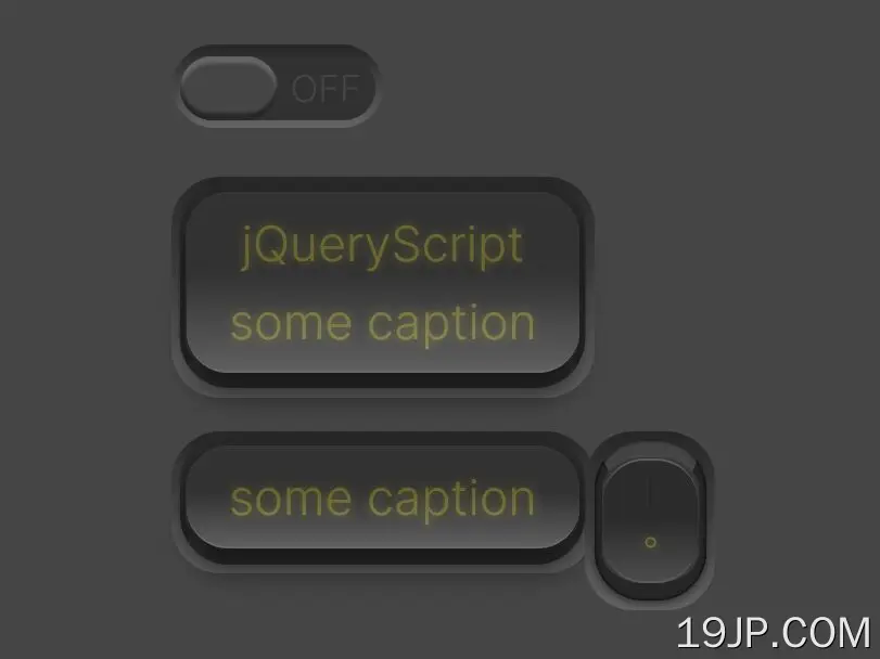 创建逼真 切换/推送/滑动开关 jQuery rsCheckboxSwitch