最新资源


简介
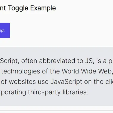
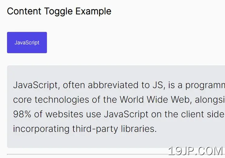
TogglePanel是一个轻量级的jQuery插件,它提供了一种优雅的方式来在页面上创建可访问的、移动友好的可切换内容(如剧透和手风琴),并支持ARIA属性、角色和键盘交互。
更多功能:
- 自定义切换模式:滑动、切换或功能。
- 自动关闭移动设备上的所有面板。
- 在打开的面板上自动设置焦点。
- 自定义触发事件:点击或鼠标悬停。
- 自定义ARIA标签。
如何使用它:
1.启用一个按钮来显示/隐藏DIV元素。
<button type="button" id="trigger-example">Toggle Panel-Example</button>
<div id="panel-example" class="panel">
  Content To Toggle
</div>
2.在页面加载时隐藏DIV元素。
.panel {
  display: none;
}

.tgp__panel--is-opened {
  display: block !important;
}
3.确定是否在页面加载时打开DIV面板。
<button type="button" data-tgp-panel-id="trigger-example" data-tgp-opened="true">Toggle Panel-Example</button>
<div id="panel-example" class="panel">
  Content To Toggle
</div>
4.在jQuery之后加载TogglePanel插件。
<script src="/path/to/cdn/jquery.min.js"></script>
<script src="/path/to/jquery.toggle-panel.js"></script>
5.初始化插件并完成。
$('#trigger-example').togglePanel({
  // options here
});
6.使用这个插件来创建一个可访问的手风琴接口。
<div id="wrapper">
  <div>
    <button type="button" id="trigger-1">Toggle Panel 1</button>
    <div id="panel-1" class="panel">
      Accordion 1
    </div>
  </div>
  <div>
    <button type="button" id="trigger-2">Toggle Panel 2</button>
    <div id="panel-2" class="panel">
      Accordion 2
    </div>
  </div>
  <div>
    <button type="button" id="trigger-3">Toggle Panel 3</button>
    <div id="panel-3" class="panel">
      Accordion 1
    </div>
  </div>
</div>
$('button').togglePanel({
  panel: 'next',
  mode: 'toggle',
  wrapper: $('#wrapper'),
  connect: true,
});
7.所有默认插件选项。
$('#trigger-example').togglePanel({

  // CSS class prefix
  prefix : 'tgp',

  // wrapper of connected panels
  wrapper: false,

  // if true, only one panel can be opened
  connect: false,

  // next panel or an unique panel ID
  panel: 'next',

  // trigger event: 'click' or 'mouseover'
  event: 'click',

  // If 'panel' setting = "function", this function will be called
  findPanel: function() {},

  // 'slide', 'toggle', or 'custom'
  mode: 'slide',

  // auto move focus to the opened panel
  autoFocus: true,

  // allow the trigger button to close its panel
  selfClose: true,

  // return focus to the trigger after closing
  returnFocus: true,

  // close panel after mouse leaving with delay
  autoHide: false,

  // delay in ms
  delay: 300,

  // disable clicks on the first levels
  disableFirstLevel: false,

  // remove titles from trigger buttons
  removeTitle: false,

  // close all panels on mobile devices
  smallScreenBreakpoint: 767,

  // labels for accessibility
  panelLabel: '',
  closeLabel: 'Collapse',
  openLabel: 'Expand',

  // If 'mode' setting = 'custom', these functions will be called
  customShow: function() {},
  customHide: function() {},

});
8.回调。
$('#trigger-example').togglePanel({

  onShow: function () {},
  onShowEnd: function () {},
  onHide: function () {},
  onHideEnd: function () {}

});
9.API方法。
// remove auto focus on init
$('button[id^=trigger]').trigger('no-autofocus.tgp');

// show panel
$('button[id^=trigger]').trigger('show.tgp');

// hide panel
$('button[id^=trigger]').trigger('hide.tgp');

// destroy
$('button[id^=trigger]').trigger('destroy.tgp');
预览截图
 可访问内容切换插件 jQuery切换面板