最新资源


简介
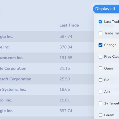
RWD表模式是一个轻量级、易于使用、移动优先、渐进增强的jQuery响应表插件,适用于最新的Bootstrap 5框架。
它会自动将超过屏幕宽度的表格列折叠到下拉菜单中。然后,用户只需单击菜单中相应的复选框,就可以轻松地显示或隐藏所需的表列
此外,该插件支持固定表头和可排序功能,这些功能的增强进一步提高了大型/复杂HTML表的可用性和交互性。
参见:
- JavaScript和CSS中的10个最佳响应表插件
如何使用它:
1.加载样式表rwd表格.css和JavaScriptrwd-table.js格式在Bootstrap 5项目中。
<!-- jQuery and Bootstrap -->
<link rel="stylesheet" href="/path/to/cdn/bootstrap.min.css" />
<script src="/path/to/cdn/jquery.min.js"></script>
<script src="/path/to/cdn/bootstrap.bundle.min.js"></script>

<!-- RWD-Table-Patterns -->
<link rel="stylesheet" href="dist/css/rwd-table.css" />
<script src="dist/js/rwd-table.js"></script>
2.使用CSS类“table responsived”将HTML表包装到DIV容器中。然后通过数据优先级属性
<div class="table-responsive">
  <table cellspacing="0" id="example-table" class="table table-small-font table-tighten table-bordered table-striped">
    <thead>
      <tr>
        <th>Index</th>
        <th data-priority="1">Last Trade</th>
        <th data-priority="2">Trade Time</th>
        <th data-priority="3">Change</th>
        ...
      </tr>
    </thead>
    <tbody>
      ...
    </tbody>
  </table>
</div>
3.初始化RWD表模式插件。
$(function() {
  $('.table-responsive').responsiveTable({
    // options here
  });
});
4.使用以下参数配置响应表。
$(function() {
  $('.table-responsive').responsiveTable({
    pattern: 'priority-columns',
    stickyTableHeader: true,
    fixedNavbar: '.navbar.fixed-top',
    addDisplayAllBtn: true,
    addFocusBtn: true,
    focusBtnIcon: 'fa fa-crosshairs',
    mainContainer: window,
    sortable: false,
    compareFunction: function(a, b, dir) { // for sortable
      return a[0].localeCompare(b[0], undefined, { numeric: true }) < 0 ? -dir : dir;
    },
    i18n: {
      focus     : 'Focus',
      display   : 'Display',
      displayAll: 'Display all'
    }
  });
});
5.您也可以初始化插件并通过HTML传递选项数据属性如下:
<div data-responsive-table-toolbar="example-table"></div>
<div class="table-responsive" data-pattern="priority-columns" data-sortable="true">
  <table cellspacing="0" id="example-table" class="table table-small-font table-tighten table-bordered table-striped">
    <thead>
      <tr>
        <th>Index</th>
        <th data-priority="1">Last Trade</th>
        <th data-priority="2">Trade Time</th>
        <th data-priority="3">Change</th>
        ...
      </tr>
    </thead>
    <tbody>
      ...
    </tbody>
  </table>
</div>
6.当表格数据发生变化时,更新响应表。
$('.table-responsive').responsiveTable('update');
预览截图
 Bootstrap 5 移动第一响应表解决方案